a crazy maze
Hanover, MA | Episode 2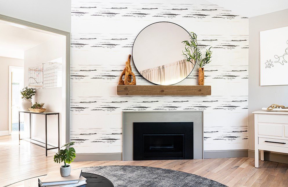
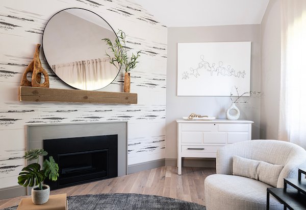
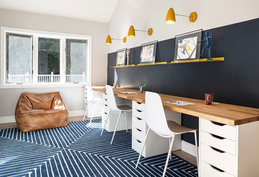
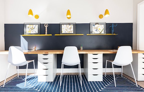
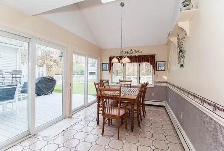
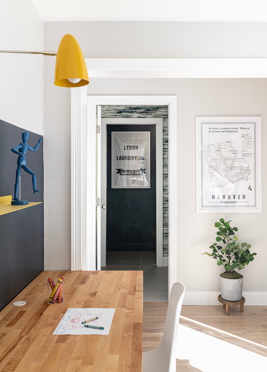
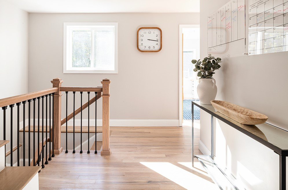
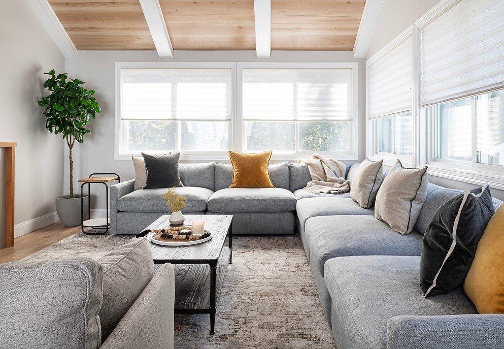
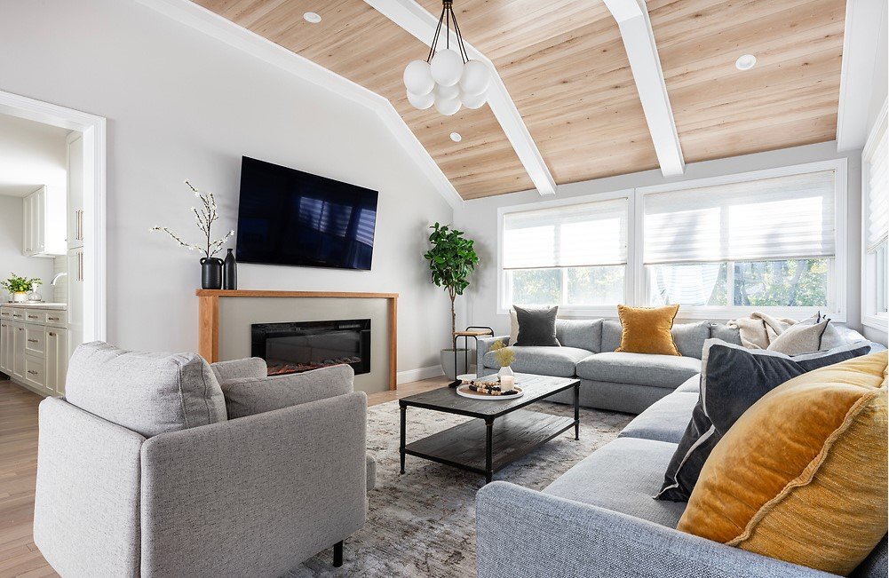
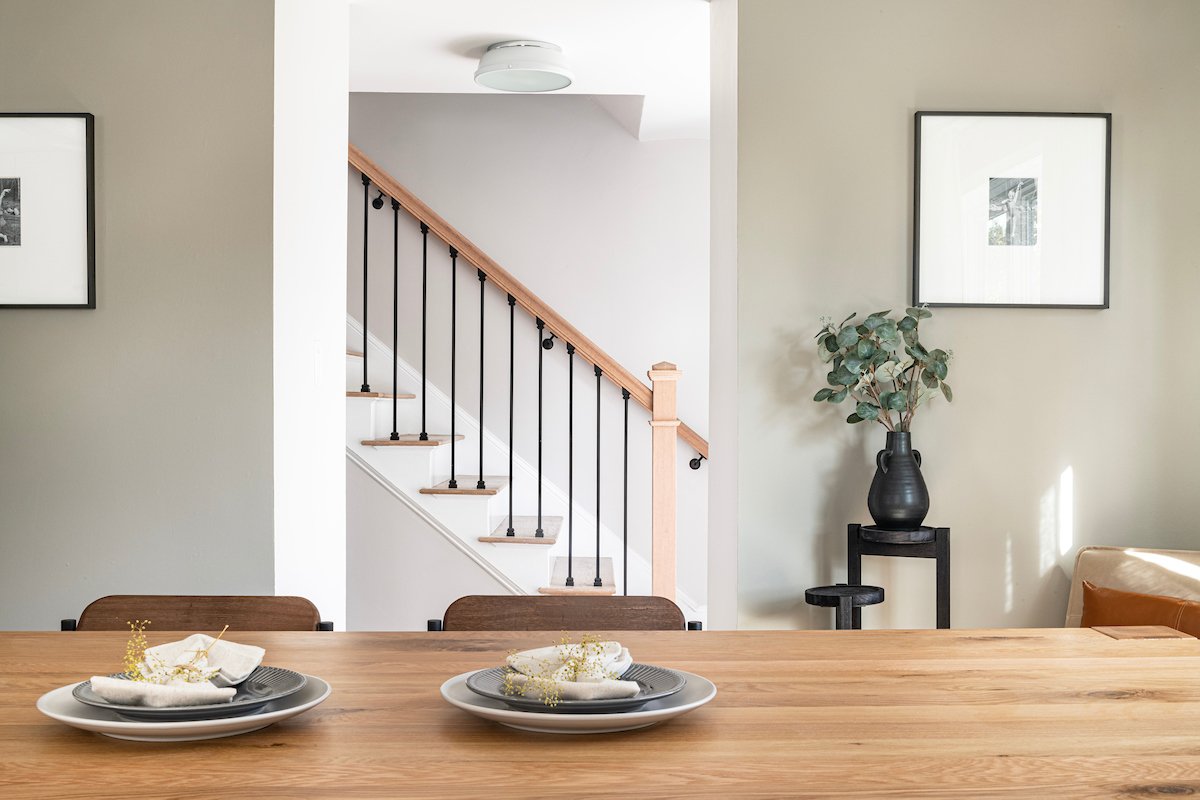
Let the comments begin on the Hope Chest in 3…2…1…Ok, ok! We know this is a controversial topic from Episode 2 of Fix My Frankenhouse. I want to give you the background on this family heirloom and why we made the changes that we did. This Hope Chest had been in Siobhan’s family for many, many years and she made it clear to us, if we didn’t make significant changes, “it would have been firewood.” While there is always an element of pushing a client out of their comfort zone, after all, that is why they hire a designer, we balance that with respecting their vision and desires for personal pieces like the Hope Chest.We made some big changes with this piece! Not only did we paint it, we modernized the legs and added pulls. Since it has been updated, the Hope Chest has moved from the garage to the adult living room! Siobhan shared in our excitement by letting us know that they, “LOVE it. That piece would have never stayed in our family until now. It just gained 100 more years of my life. My grandparents would be thrilled we not only kept it but it has been restored and we love it.” We feel so honored to work on this piece not only for Tim and Siobhan’s family but with our own family as the artists. We brought our dads into this project to work together and honor the history of this piece while also making it modern and practical.One thing that is amazing about filming, but yet also challenging, is the ability for the production team to take 14 weeks of work and conversations and condense it into 45 minutes for the show. The conversation that Mike and I had with our dads was a very small clip of our overall discussion. With the experience that Peter (my dad) and John (Mike’s dad) have, they agreed with modernizing the piece and making it functional for the entire family. Also, little did we know that in the past, Hope Chests were given as a sign of commitment for marriage, like an engagement ring. I think it may be better than getting a Caribbean cow in place of an engagement ring...! Check out the show for that fun fact from my dad!While the tables have turned from them raising us and making the rules to Mike and I taking the lead on these projects, we are humbled by the opportunity to work with both of these amazing men. Our respect for them runs deep and we are grateful for the opportunity to show our own sons what hard work and perseverance can look like. The dads are most certainly the secret sauce to this episode! While there is a lot of controversy around the Hope Chest, we worked hard as a family to respect its history, while also respecting the desire of the homeowner.Don’t worry, this isn’t our first time having to balance respecting history and making a project modern! If you look back to Episode 1, our goal was to preserve the amazing history of Mike and Nicole’s home while bringing them a modern, open concept design.Moving on from the Hope Chest and on to the overall design and feel of the house! Mike and I worked closely to turn Tim and Siobhan's Frankenhouse into a light, airy and timeless space. They bought this house five years ago and while they knew the layout was disconnected and confusing, when they saw the entertaining room and outdoor space, they were sold! BUT this house had seven different types of flooring, six staircases, three balconies, two additions and as Siobhan said, a partridge in a pear tree! Not only that, Tim and Siobhan had already met with three architects that weren’t willing to take on this project! Needless to say, this house was incredibly disjointed and lacked cohesion. One of the craziest features of this home was that it had an indoor balcony from an addition that was done years ago. While the kids loved throwing things from the balcony to the living room and putting on plays, this balcony had to go!From the contractor side, Mike knew that this time, we were going to be taking down walls in order to open up the space and flood it with light. From the design side, I knew we needed to integrate several different types of spaces to make this house a home for Tim and Siobhan. This house would need a kid zone, adult living space, and massive kitchen in the middle of the house.It was important to me that I design the kid's space so they can grow into it and transition from being able to play and do arts and crafts to also having a work station for homework. One other element of this space was making sure that the materials used would be tough but still look good. We achieved this through using butcher block for the workspace. This is a durable but modern element in this room.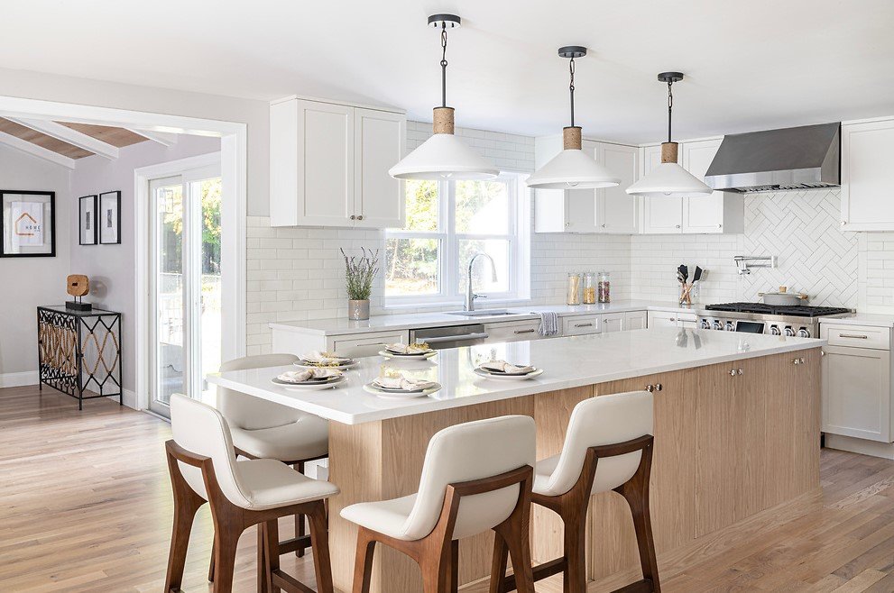
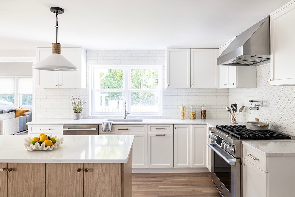
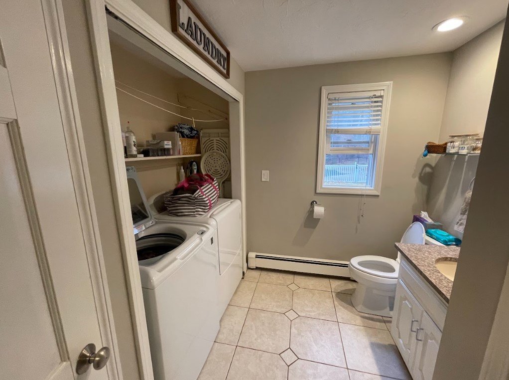
As soon as we met Siobhan, we knew the kitchen space was really important to her. We shifted the kitchen from the front of the house to the middle of the floor plan. The kitchen is the heart of the home and we wanted everyone to be able to access it easily. Since Siobhan and Tim like to entertain, we knew a large island would be an amazing addition for them. Not only would the 10 foot island work well for their family of five, but they would be able to host plenty of friends and family with this as a focal point of the kitchen. There were so many little details in this kitchen space that made it really personal and cozy. One was the selection of tile that was a nice mix of traditional subway tile and the texture of painted brick. While it took some time to design, we landed on a double box weave as a focal point of the tile. It could have been a little easier to go with a design like herringbone but I really love this unique focal point and felt that the weave design was more modern. Their kitchen transformed from a dark and cramped space into an inviting and open retreat!Now that you have a little more detail on the design, I want to share another fun behind the scenes secret! Have you ever wondered why each client seems so surprised as they walk into each room when it looks like an open space? WELL, each room is completely blocked off so that the client ONLY sees the room that you are seeing on the show! So as we move through the house, Siobhan and Tim only get to see one room at a time!We loved working on this project and are so grateful to develop a space that not only makes life easier for this family but also creates a safe haven where they can unwind. Hope that you enjoyed a little more detail around the design of this house and stay tuned for next week's episode of Fix My Frankenhouse airing Sunday, May 7th at 9pm ET on HGTV!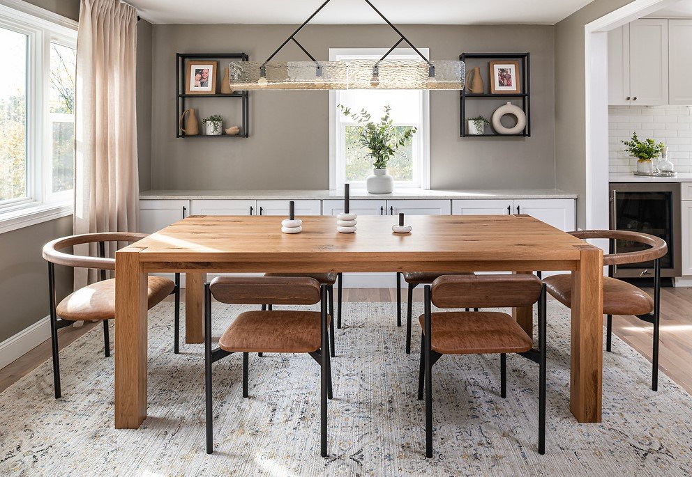
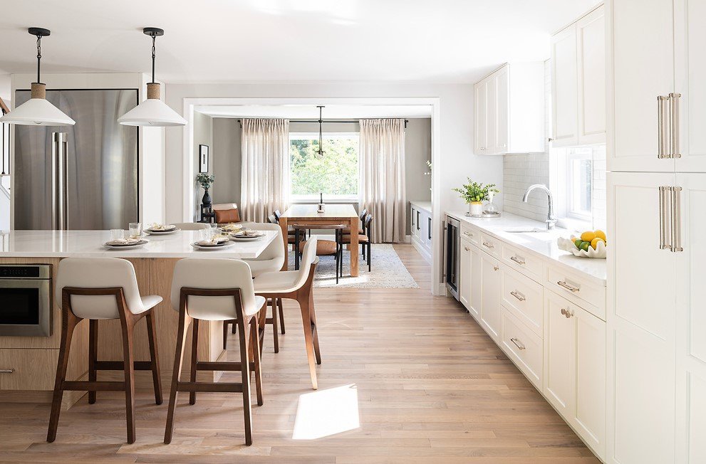

HGTV Reveal!

