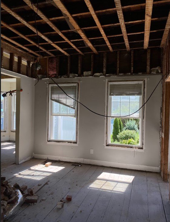
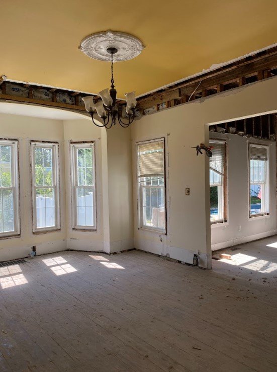
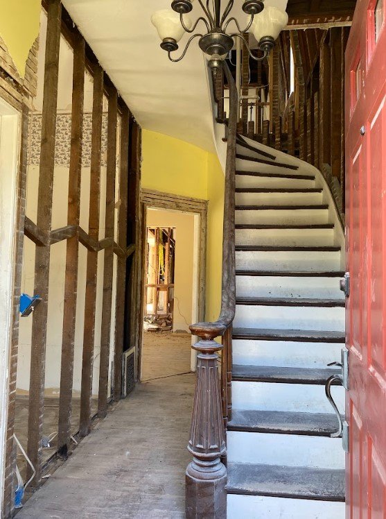
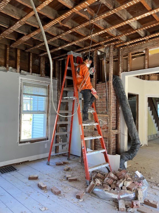
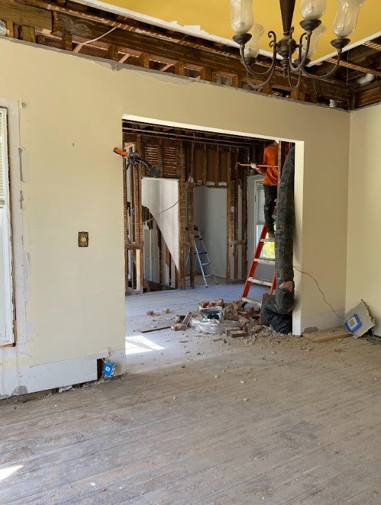
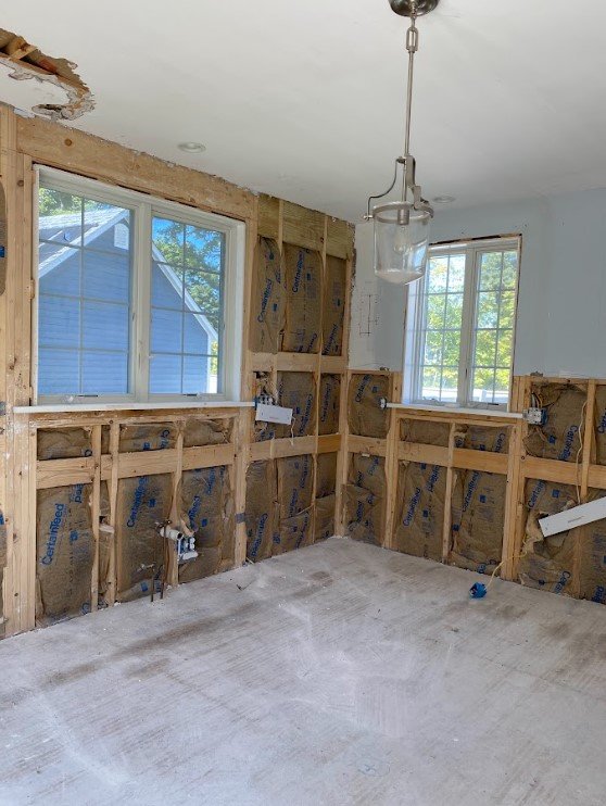
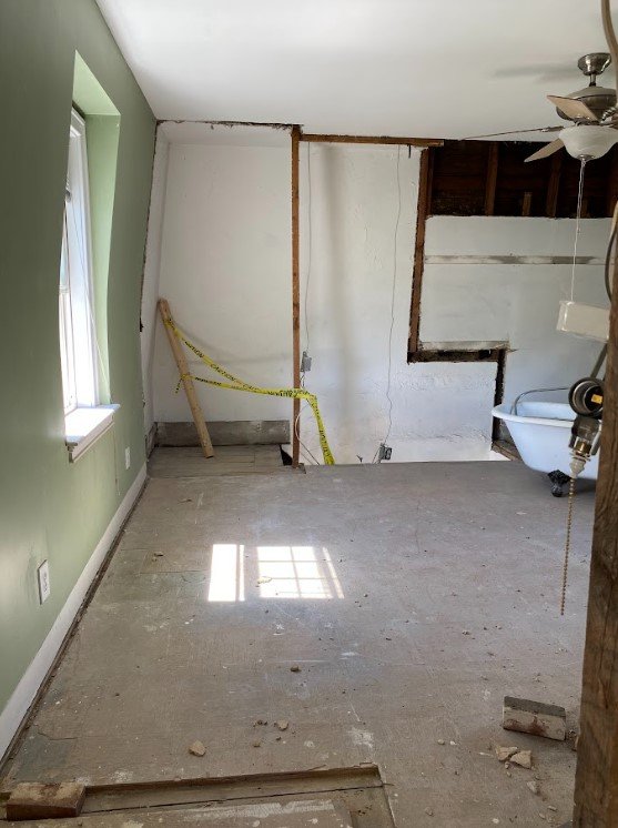
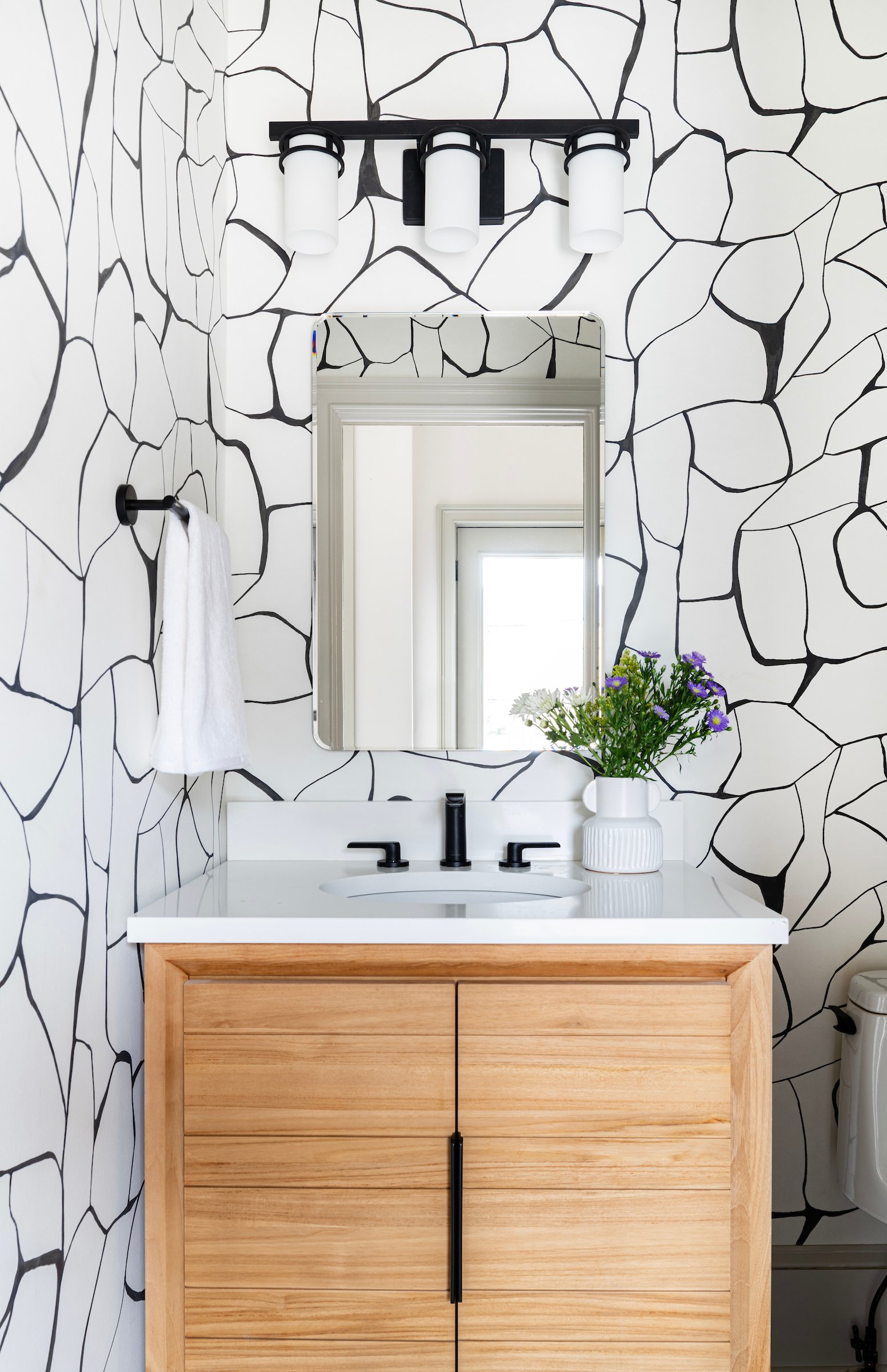
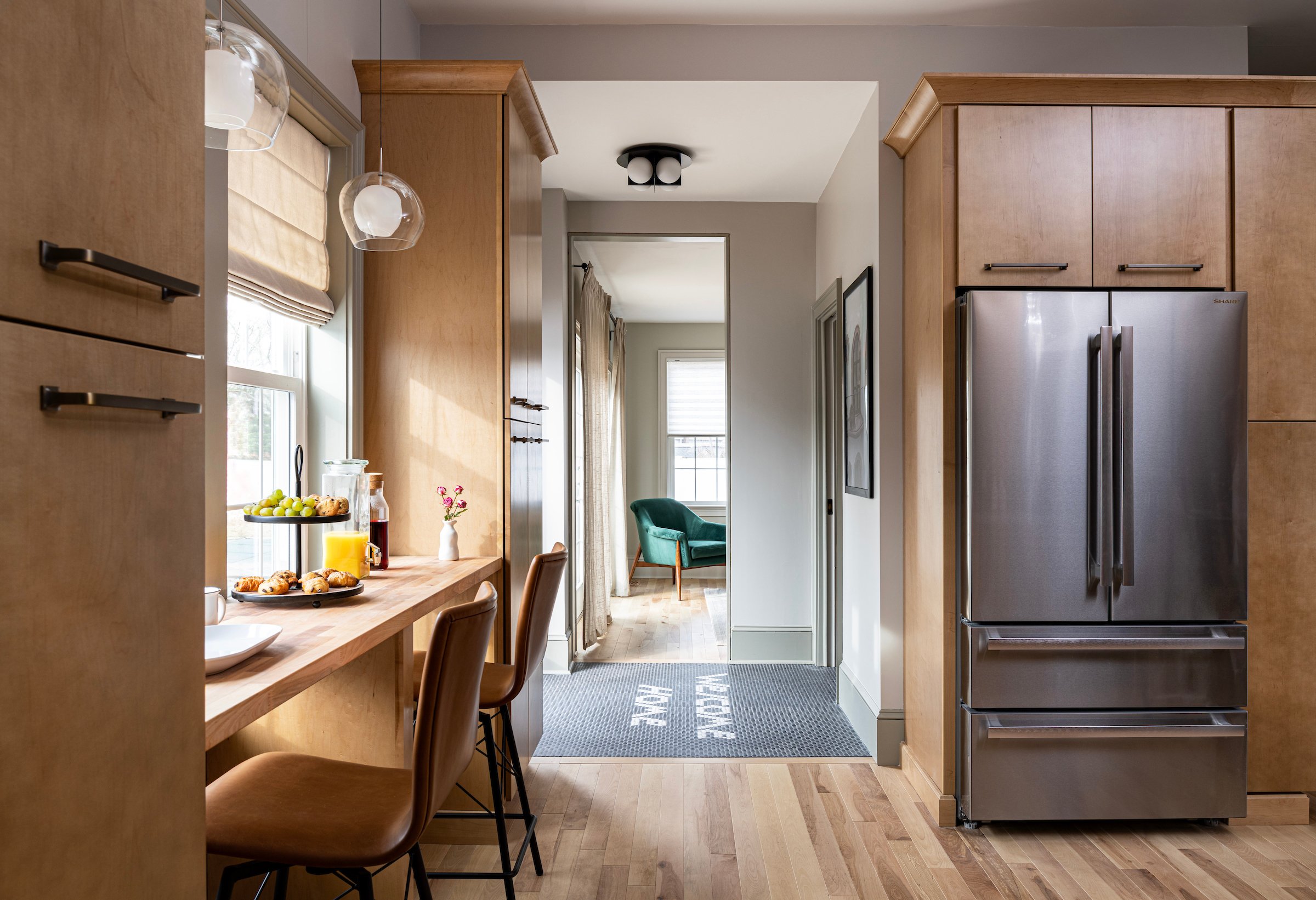
Episode 3 is here! This house was the biggest, longest and most involved project we worked on for Fix My Frankenhouse. Our clients, Ryan and Carrie, had to move out of their home for six months! To give you a reference, the homes shown in Episodes 1 and 2 were completed in twelve to fourteen weeks so this project was a big one. Even though we are under super tight timelines and often have several crews working at once (which is not the norm outside of TV!), this house was incredibly fun to work on.
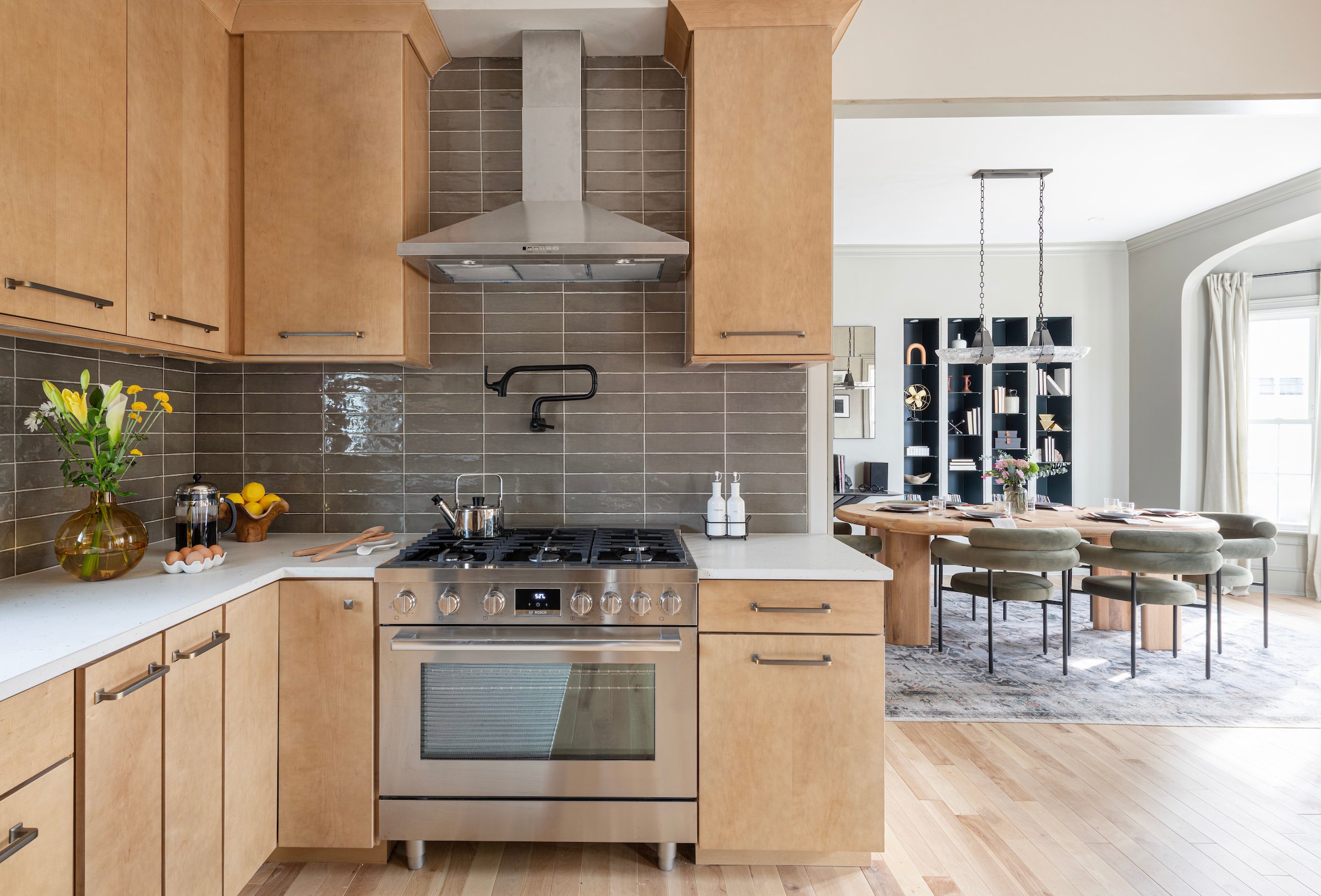
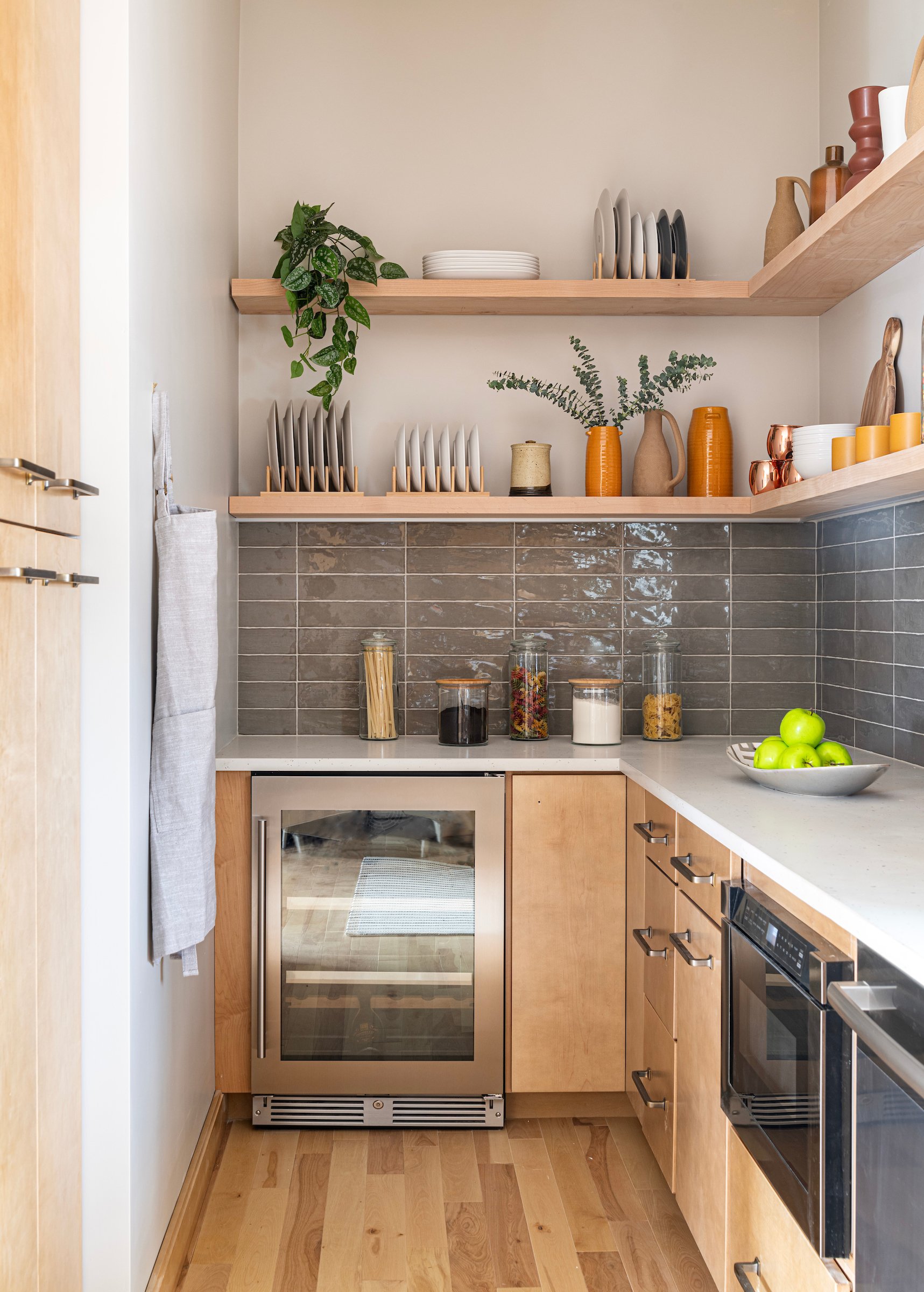
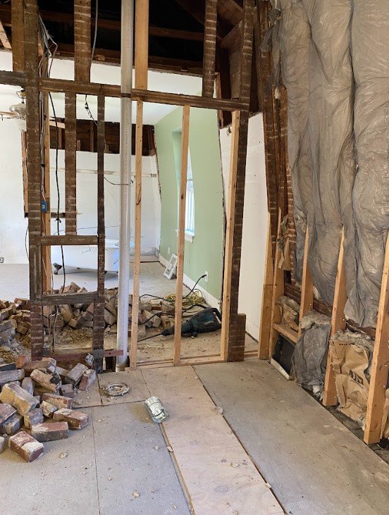
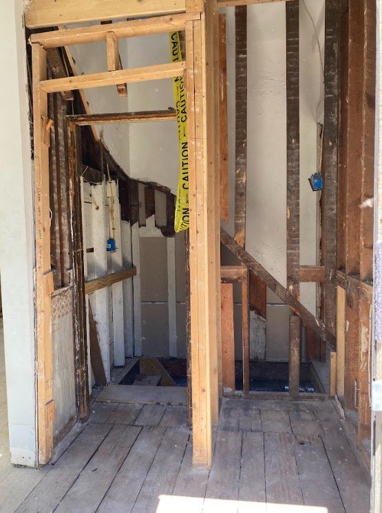
Ryan purchased this home twenty years ago and while he has made a few improvements over the years, the house remained disjointed and was no longer functional for his current lifestyle. While Ryan's main priority was design, Carrie's focus was updating the home to make it functional for their everyday life. In the other episodes, you will notice that while we do big overhauls in the home, there are spaces of the house that are not included in the design. For Ryan and Carrie's home, this was not the case! We touched every single aspect of this house.
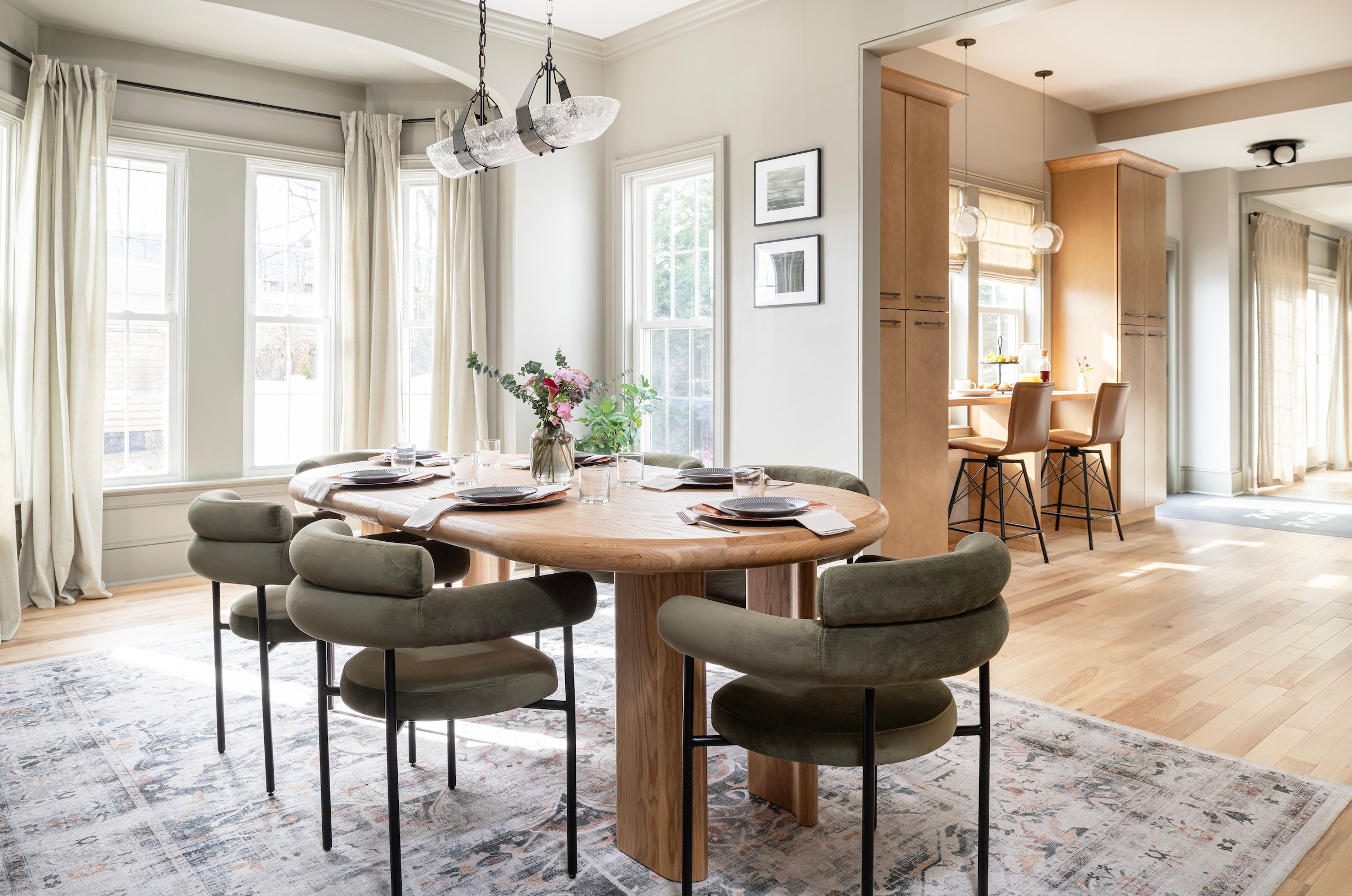
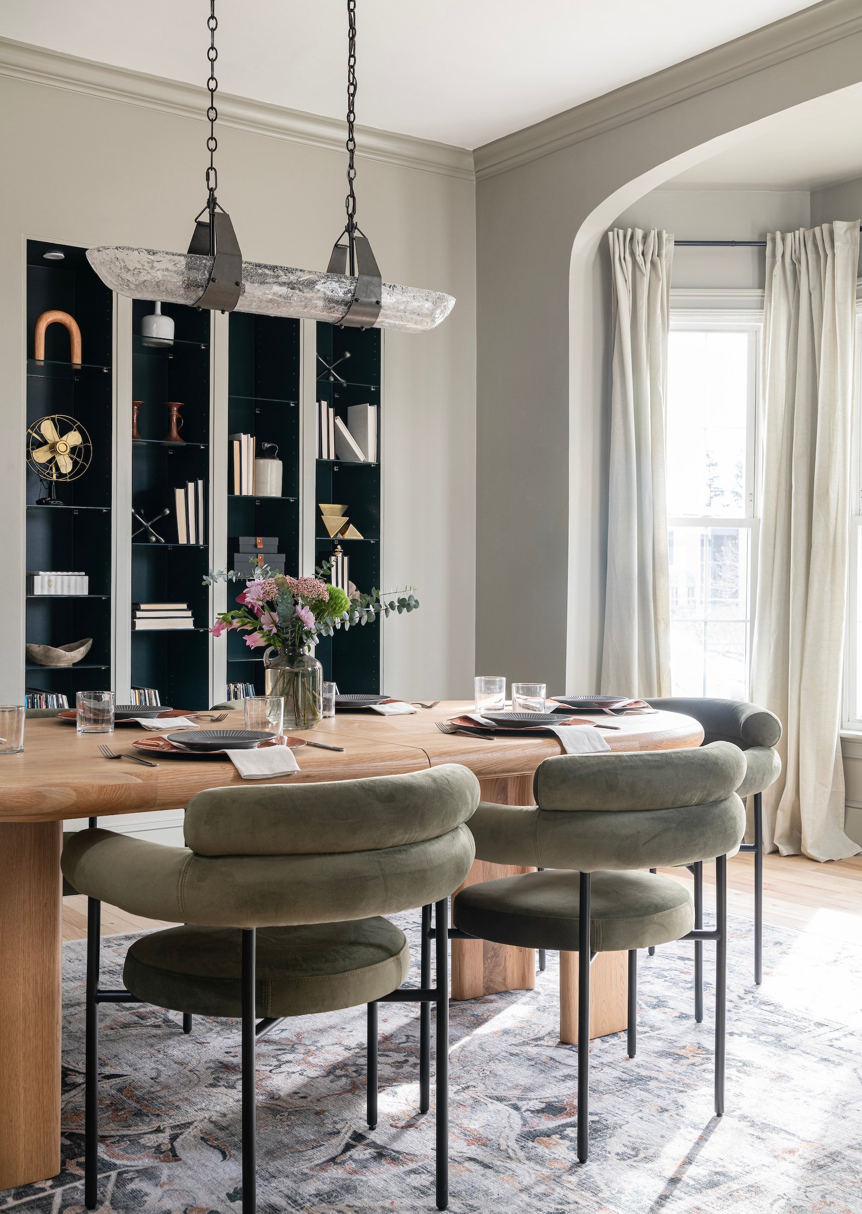
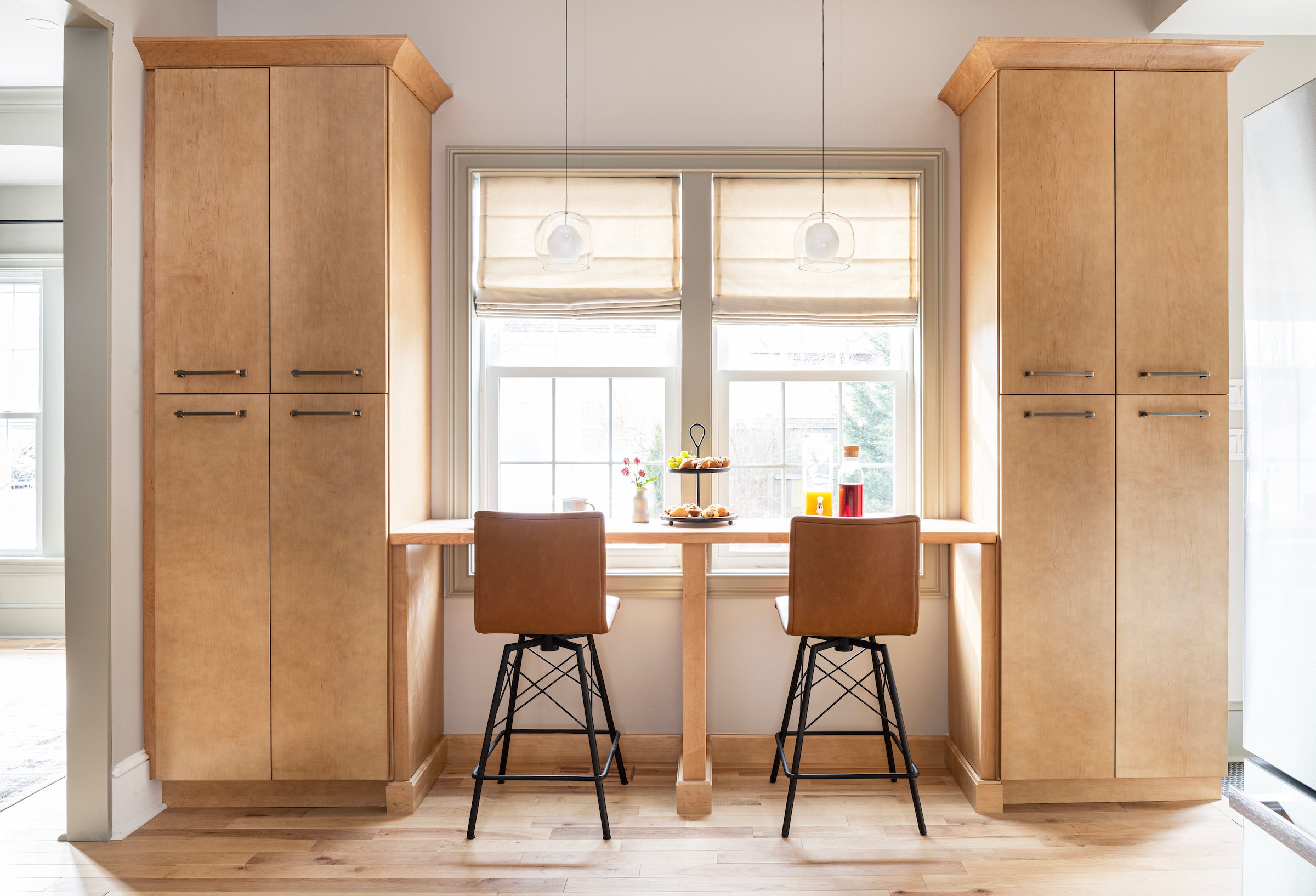
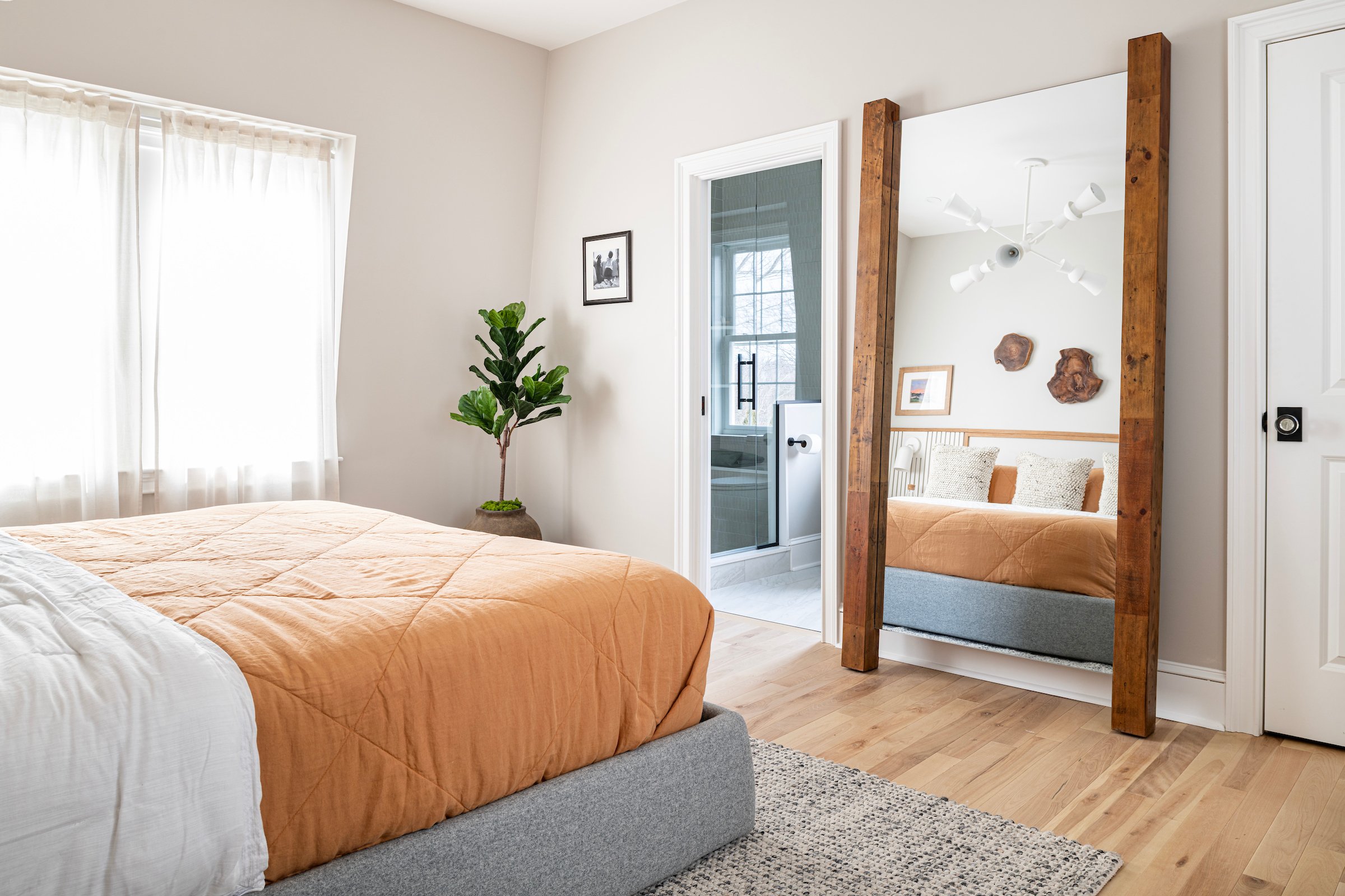
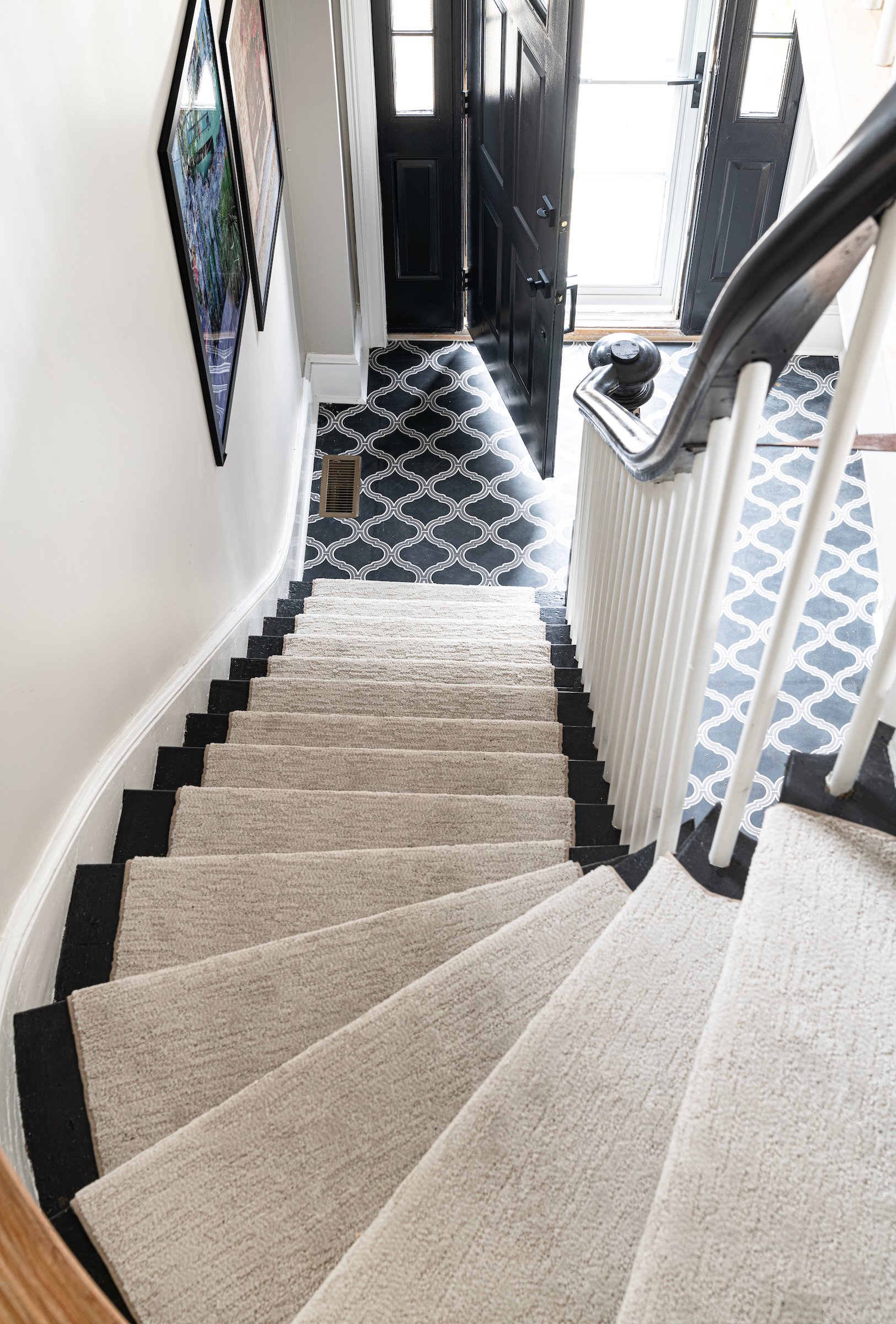
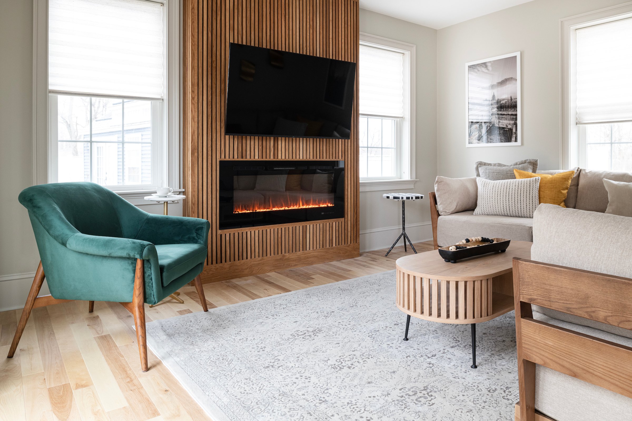
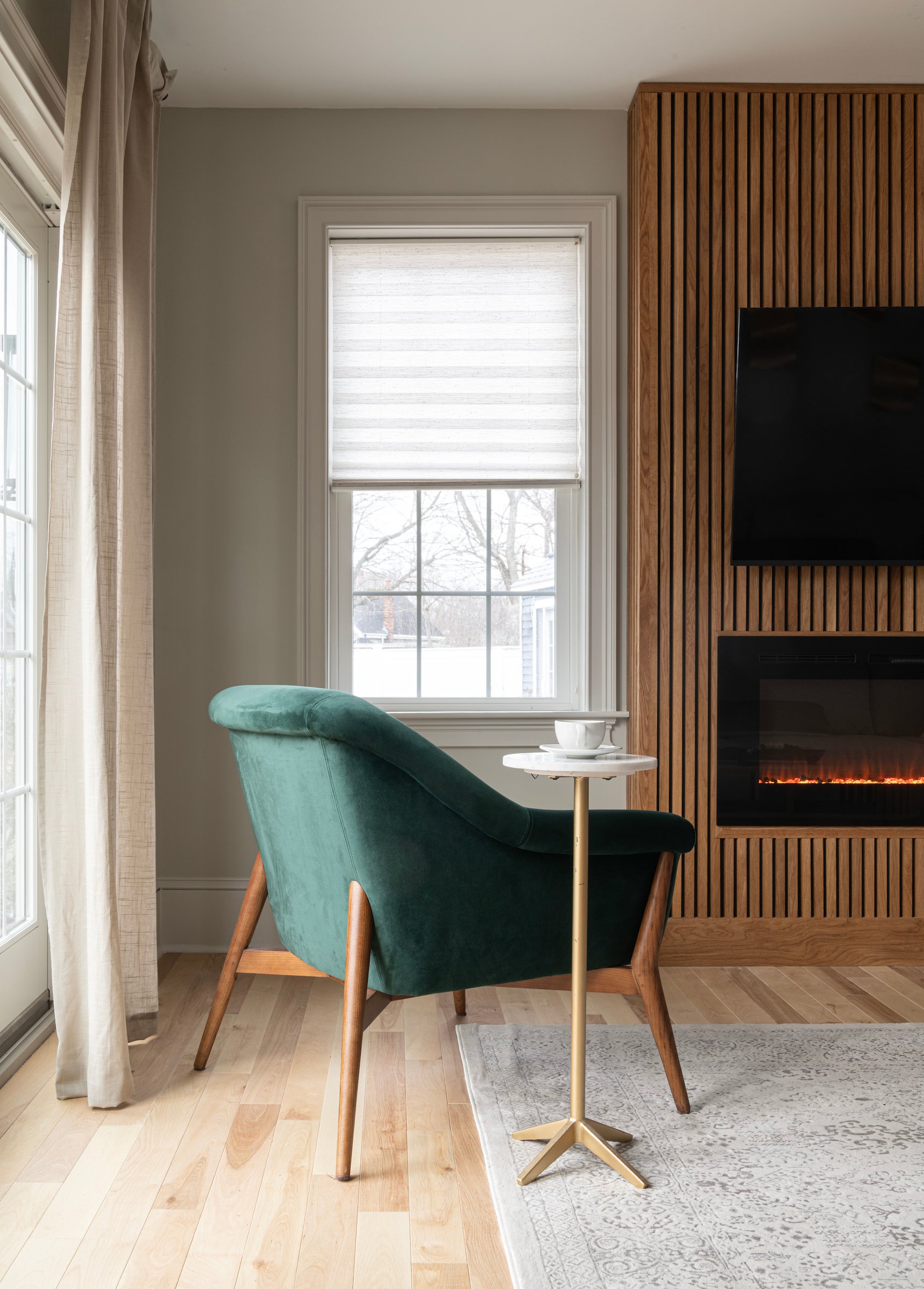
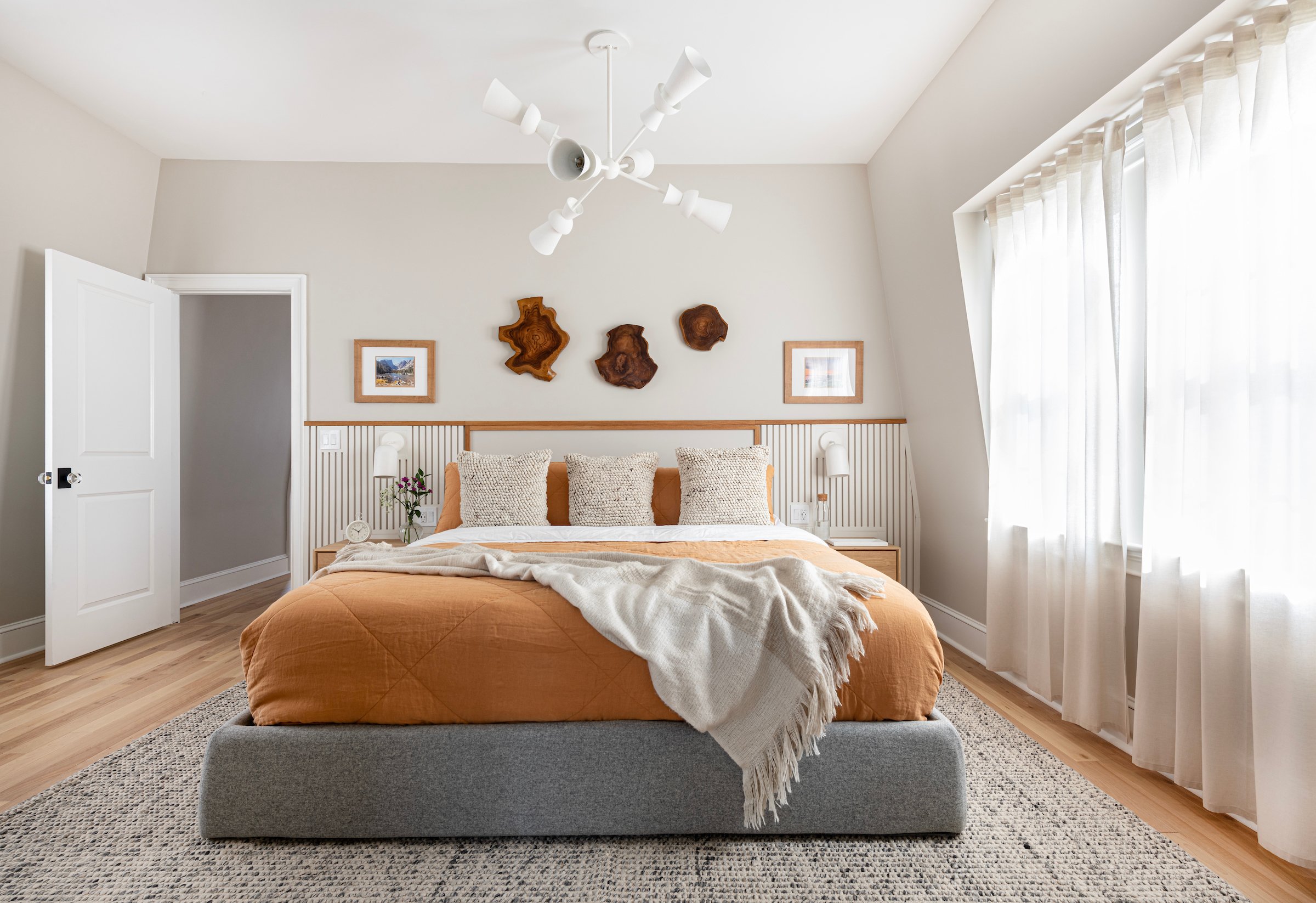
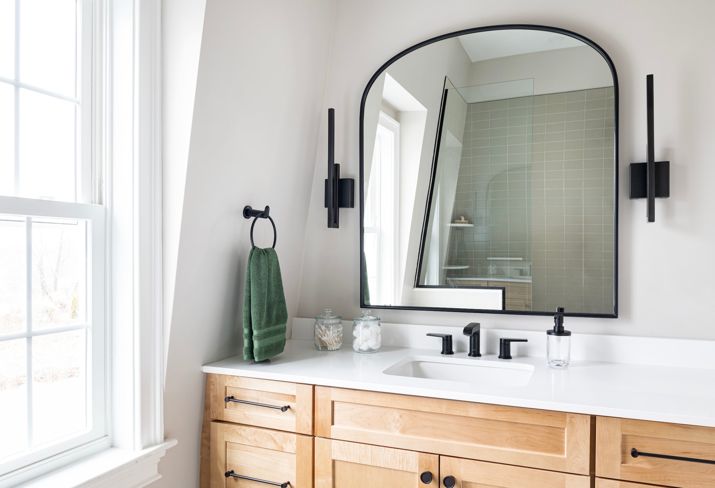
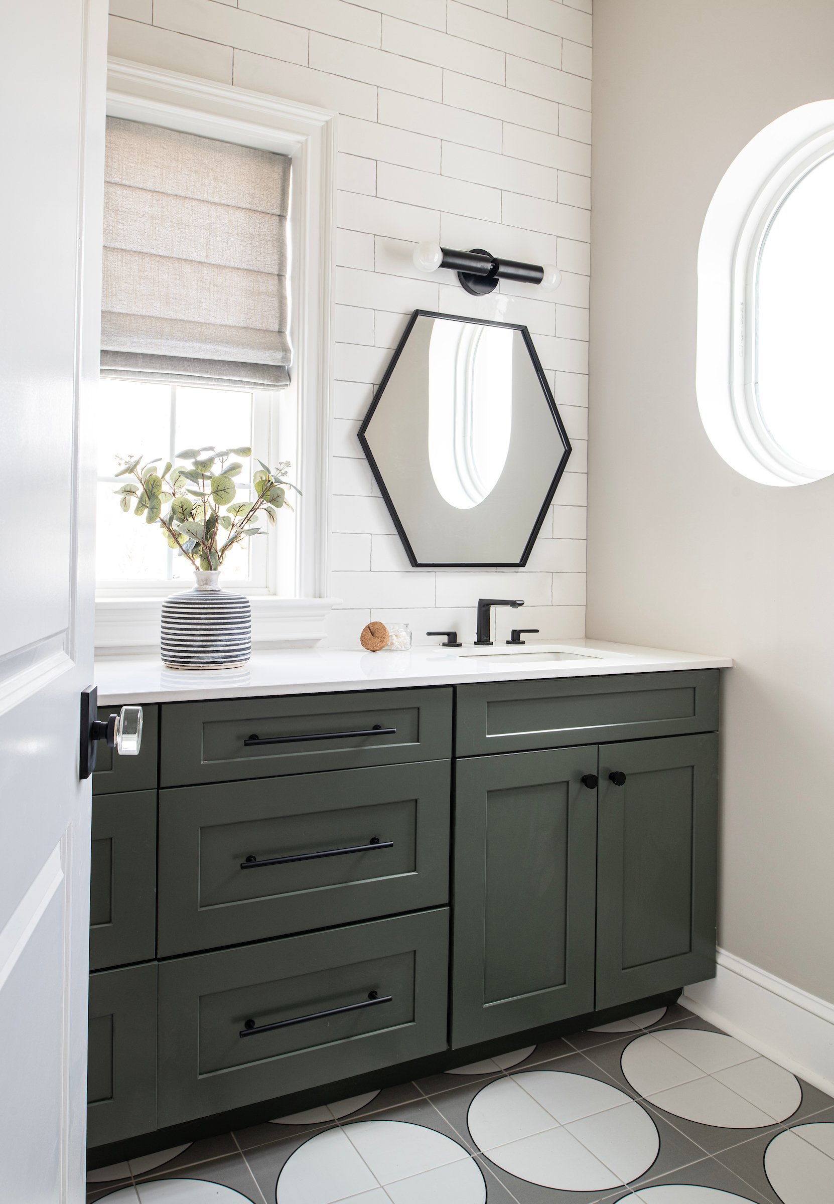
Ryan let us know he wanted a slick and modern space and Denese was able to run with that aesthetic. While slick and modern covers a wide variety of design styles, we still wanted to invoke a feeling of cozy where you are comfortable walking in the door, pouring a glass of wine and getting comfortable on the couch with your family at the end of the day. Our team incorporated warmth in each room through the use of natural wood tones and black accents. While our designs are unique and elevated, they are practical, functional and cleanable, including the light colored stair runner (which has been important to our founder since she has three boys under six!). Through Denese's background work with textiles, she has been able to really gather an understanding of what not only looks great but is also practical for a family with children.
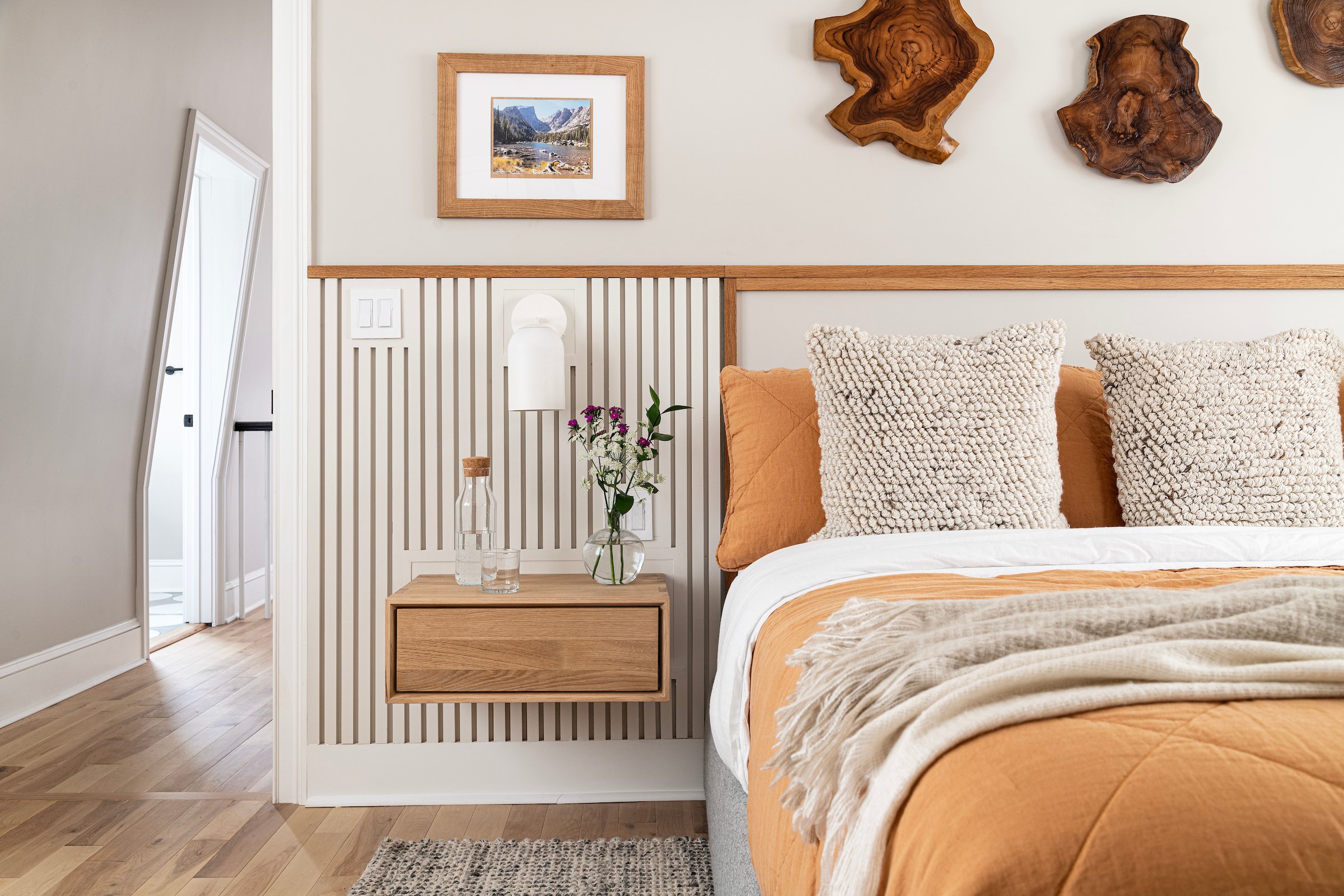
Since we were able to work so thoroughly in this house, continuity was key in this design. One element that we were able to use in multiple rooms was vertical slats. You can see this in the new family room where we integrated the slats with a natural wood color and also in the primary bedroom where the headboard was made with painted, vertical slats.
