The submarine
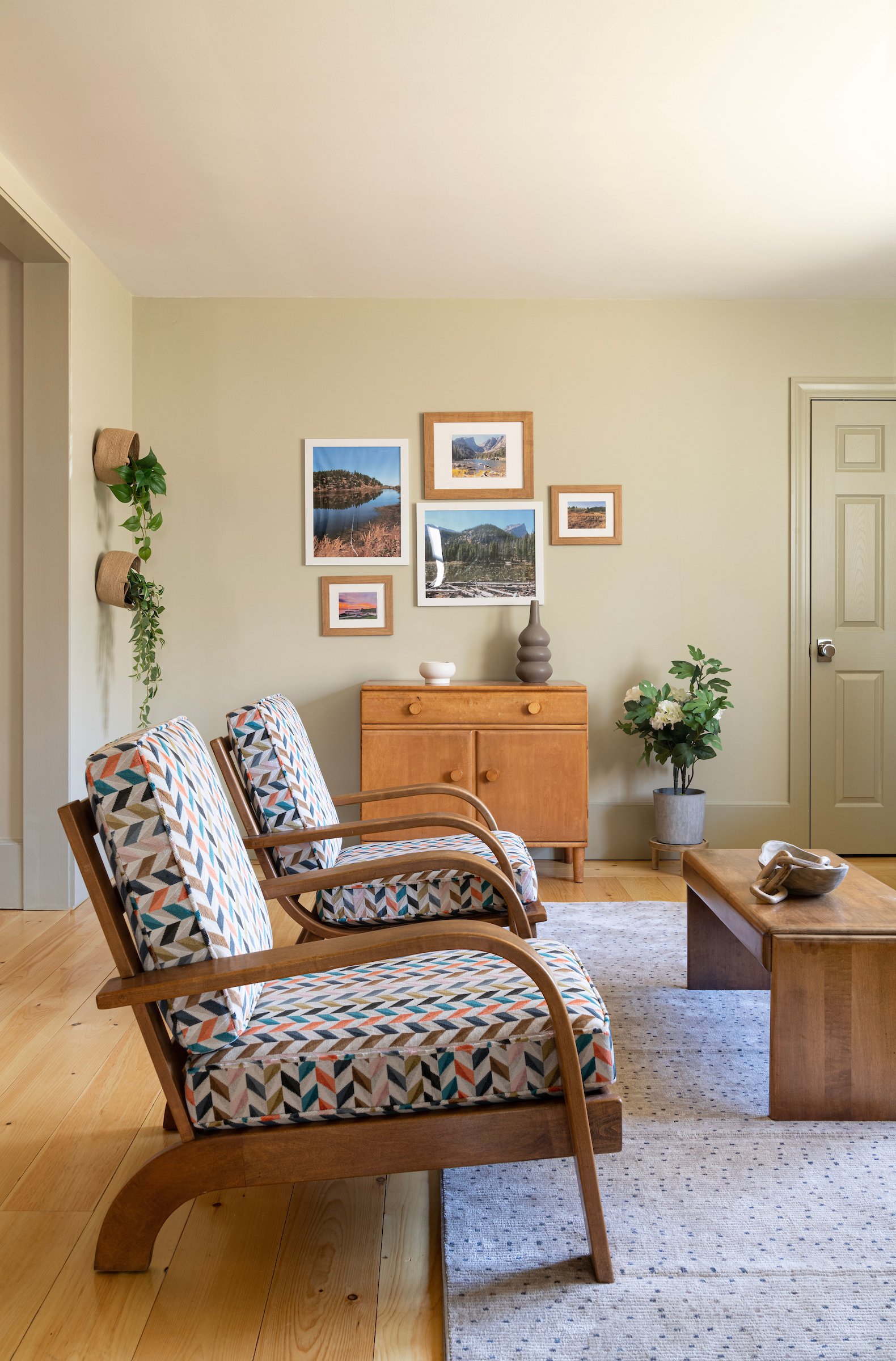
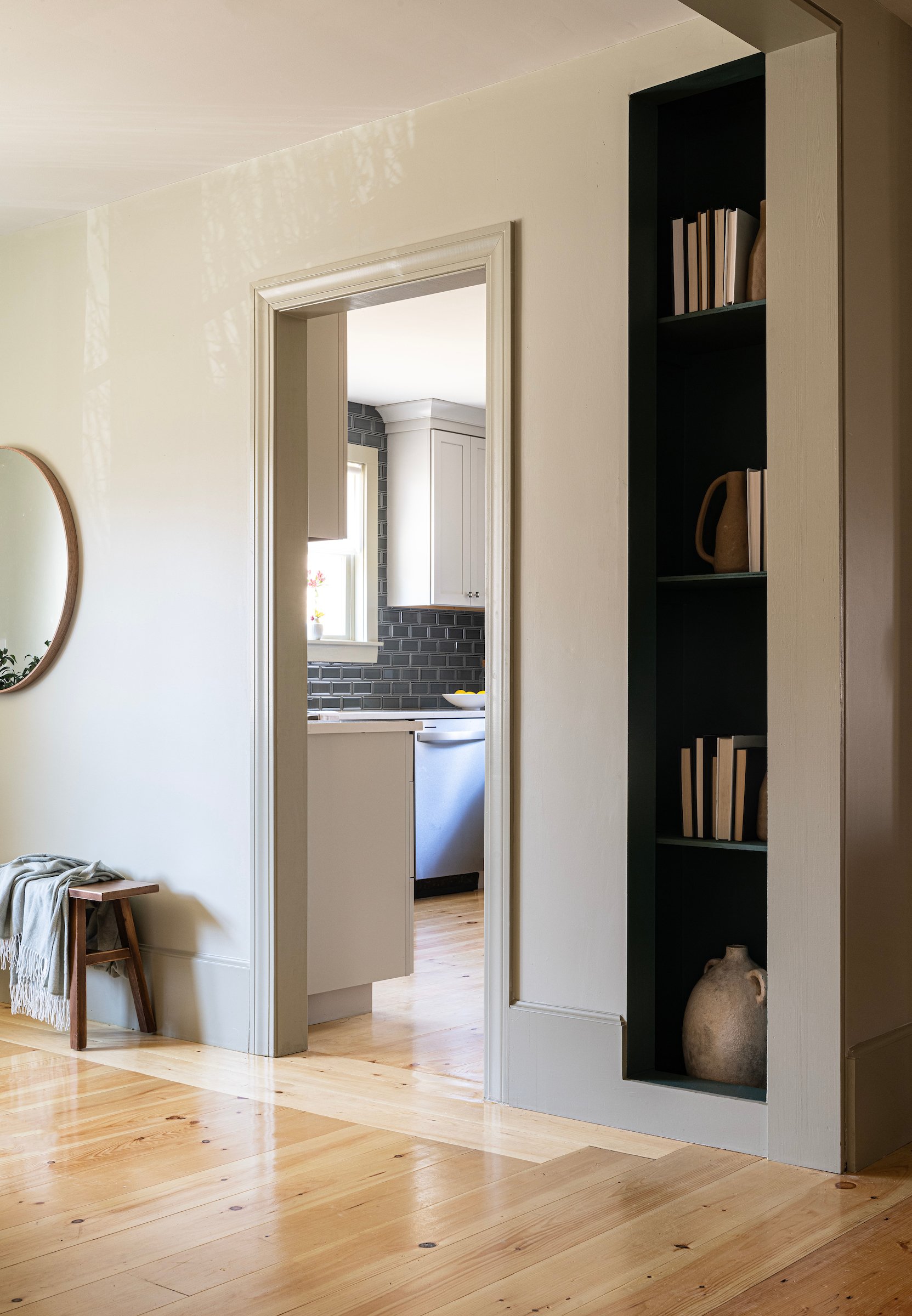
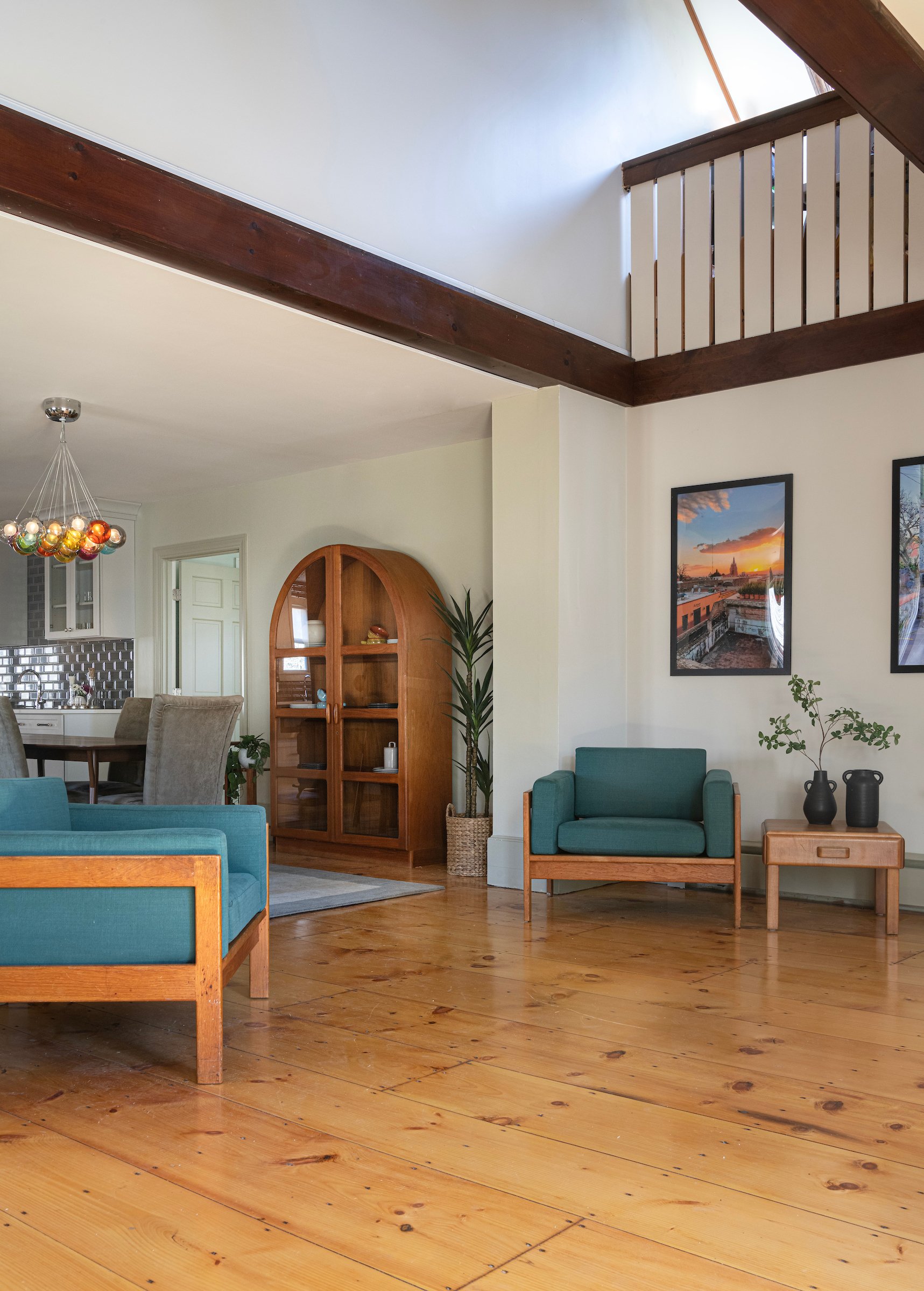
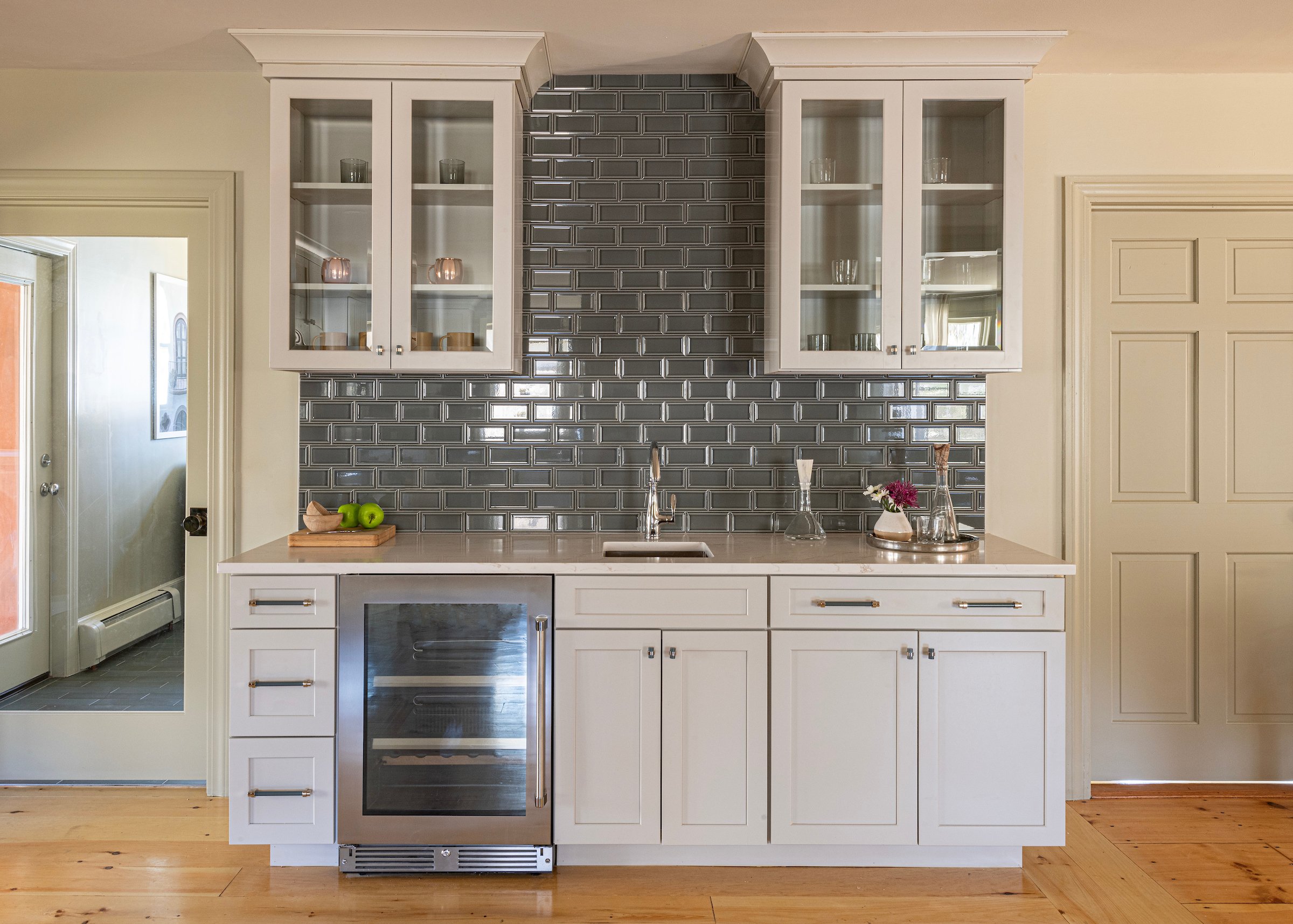
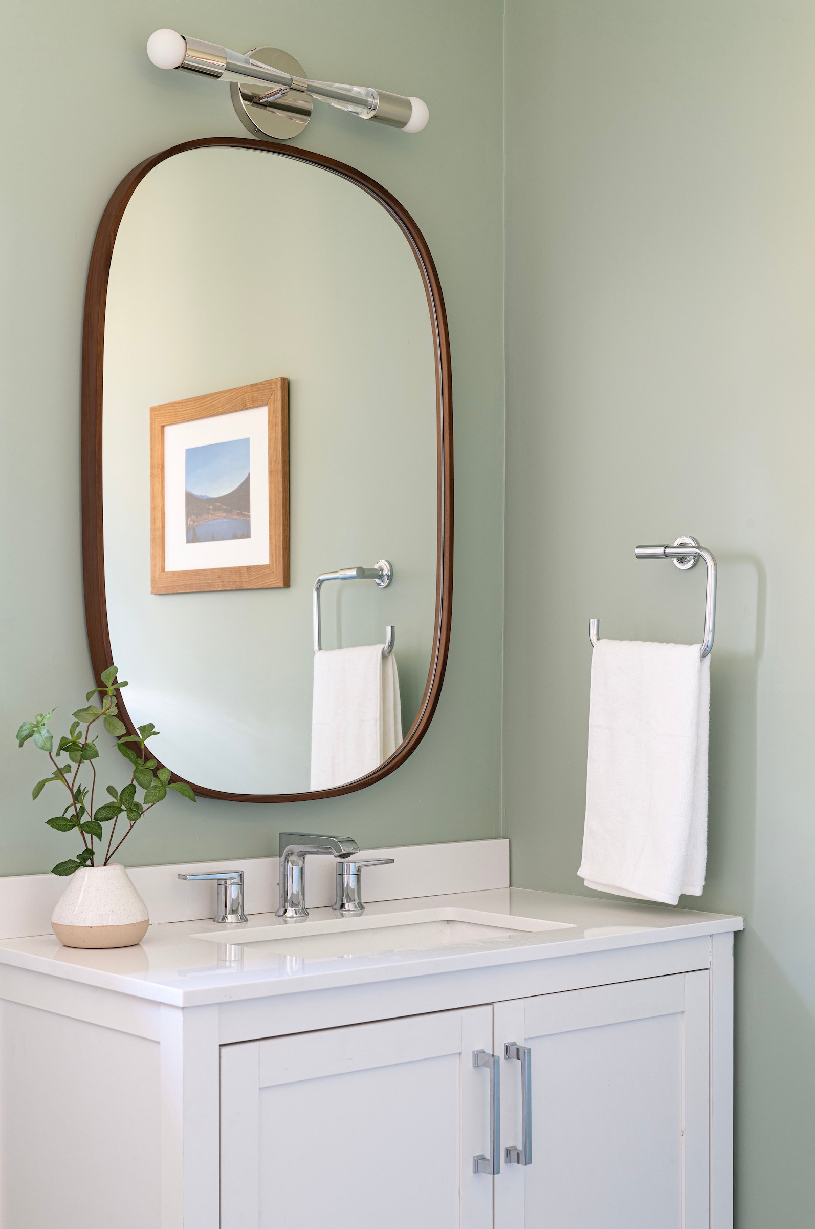
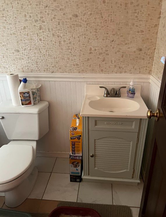
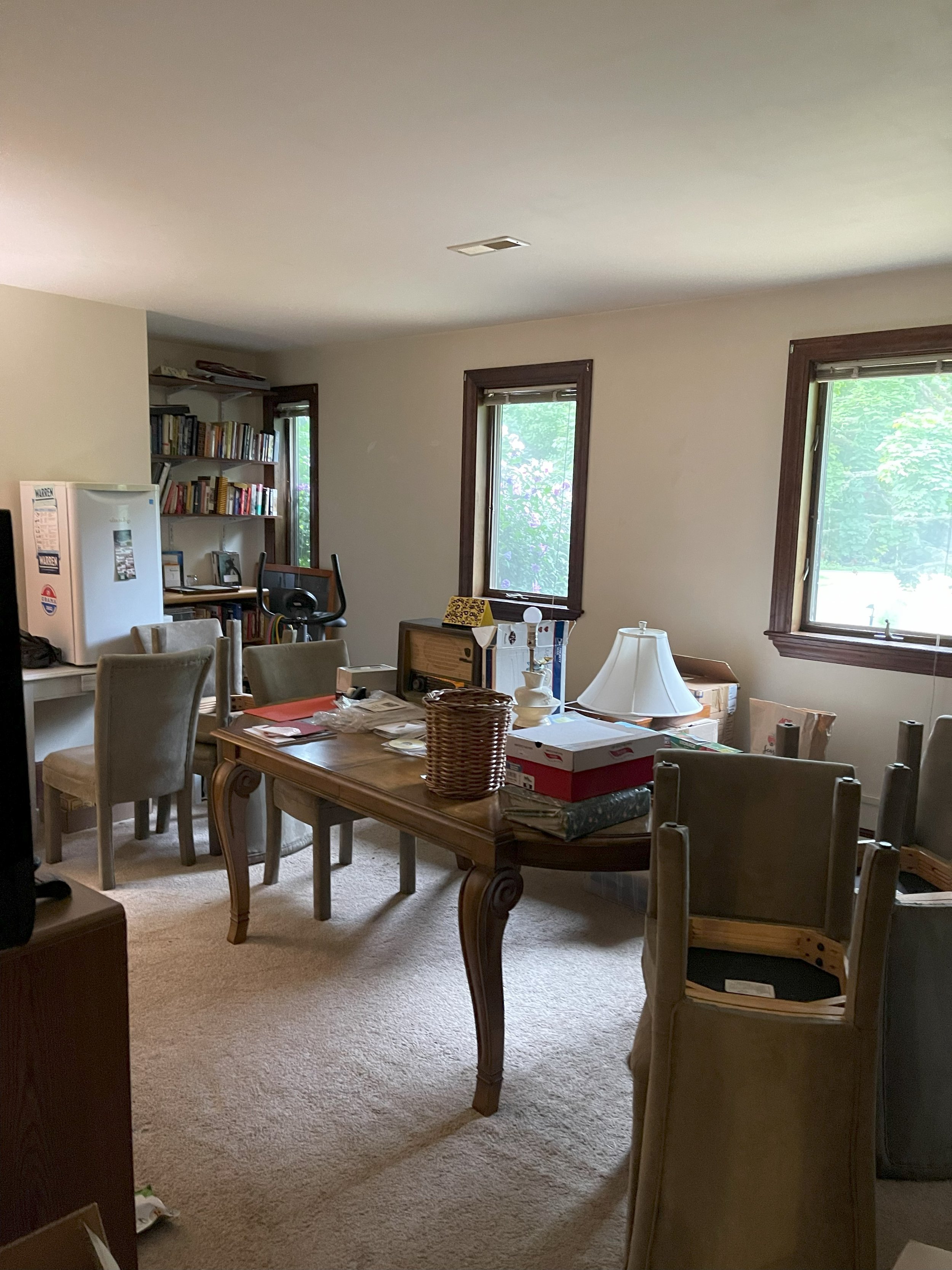
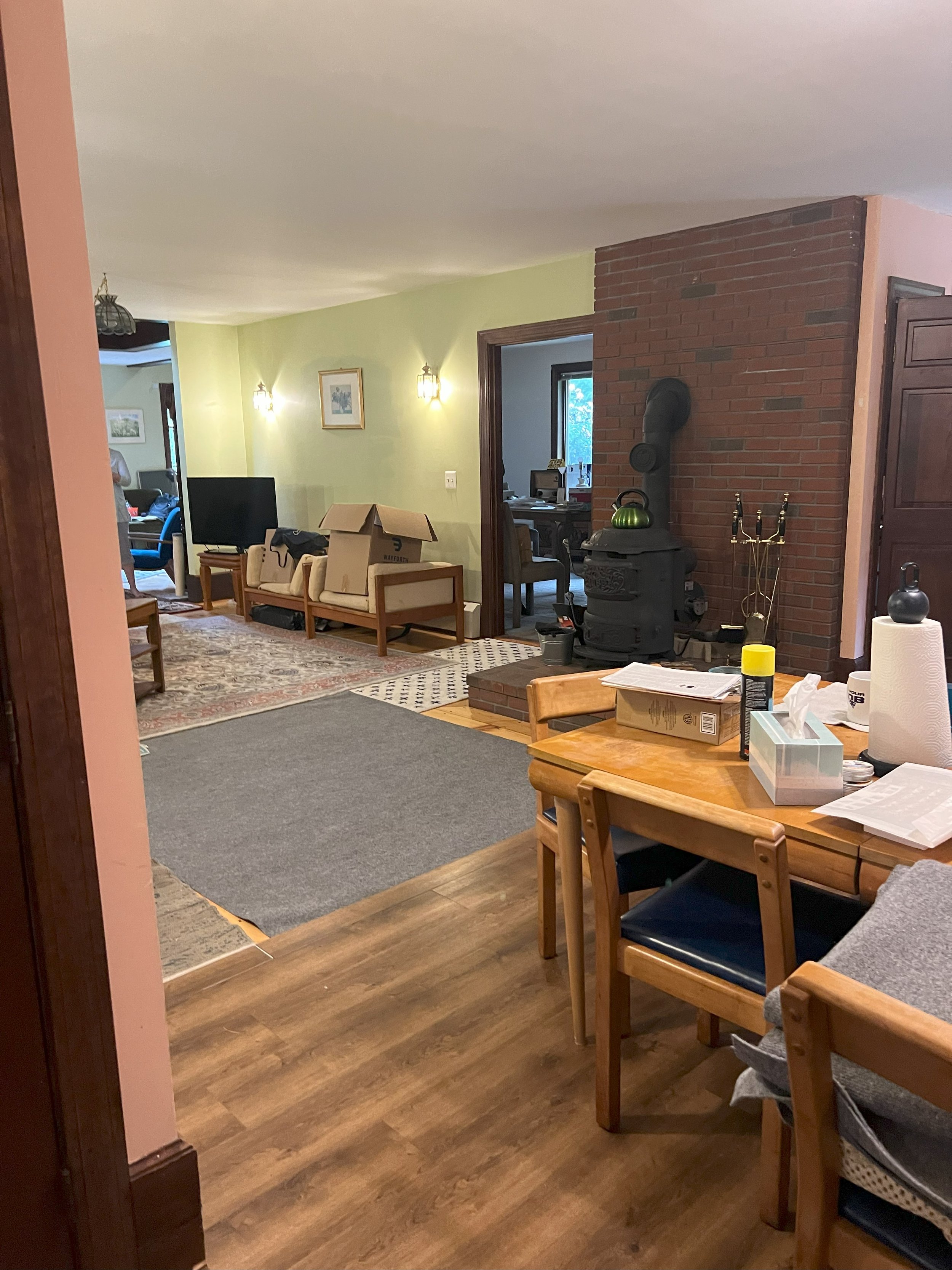
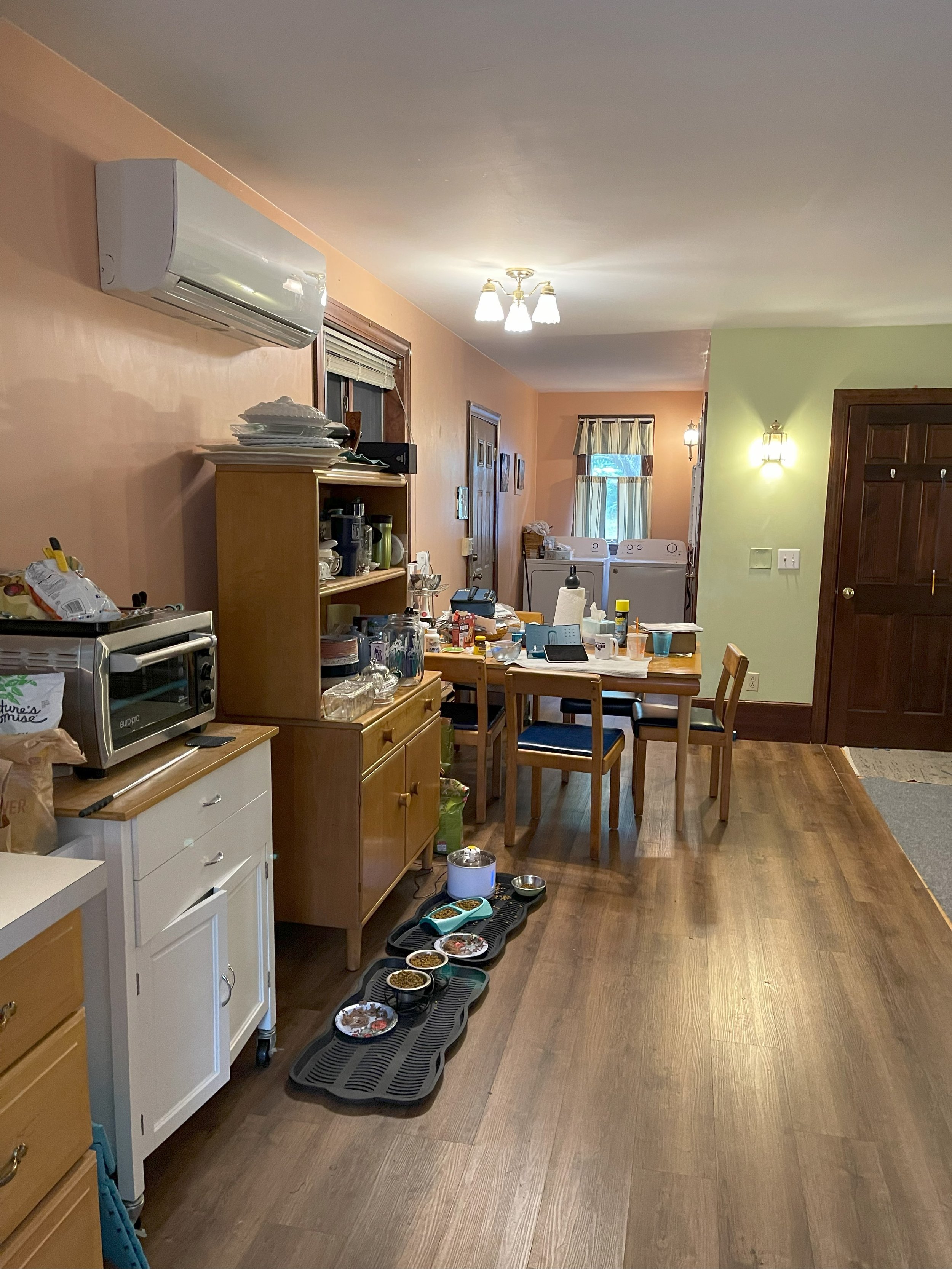
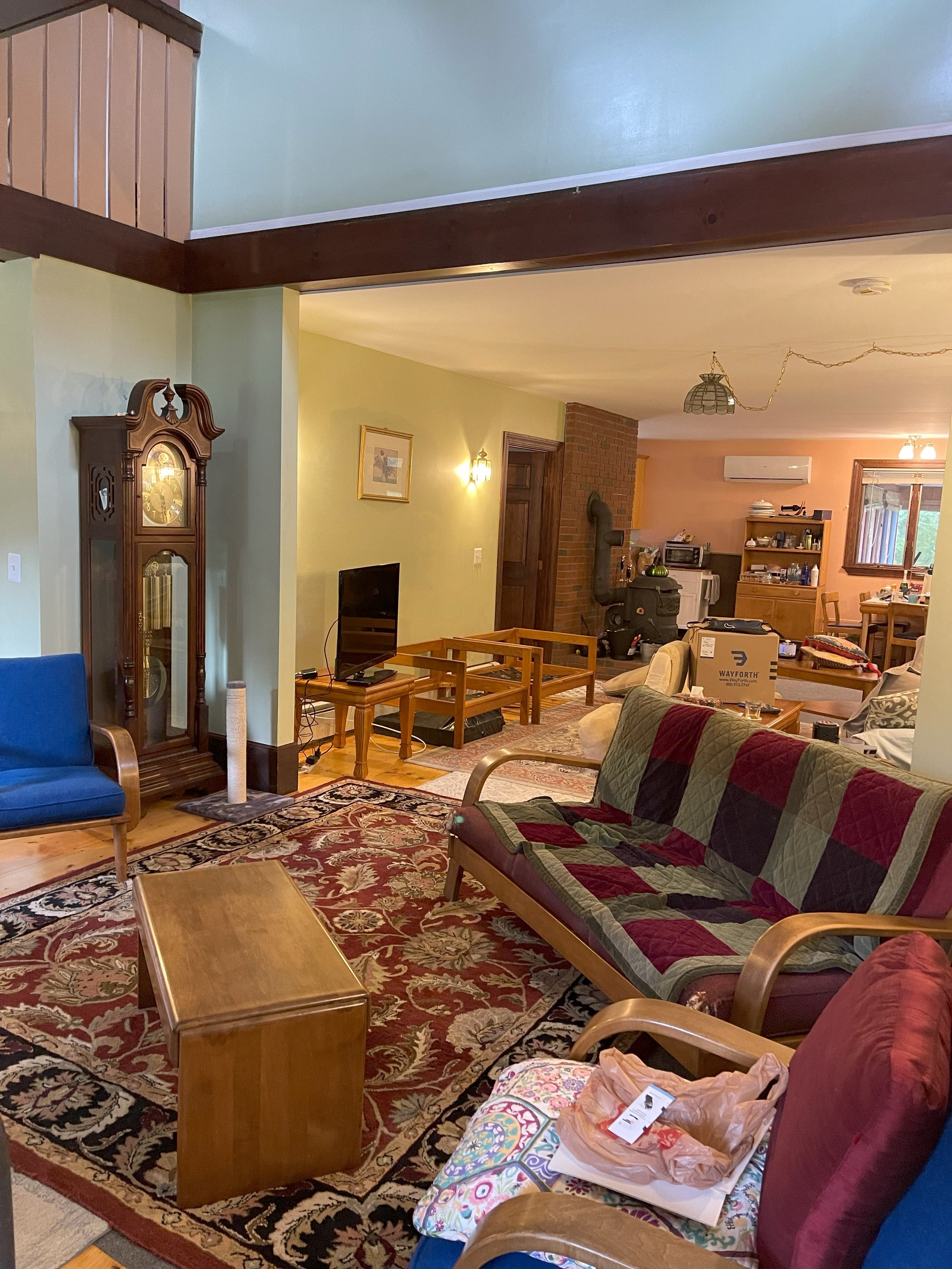
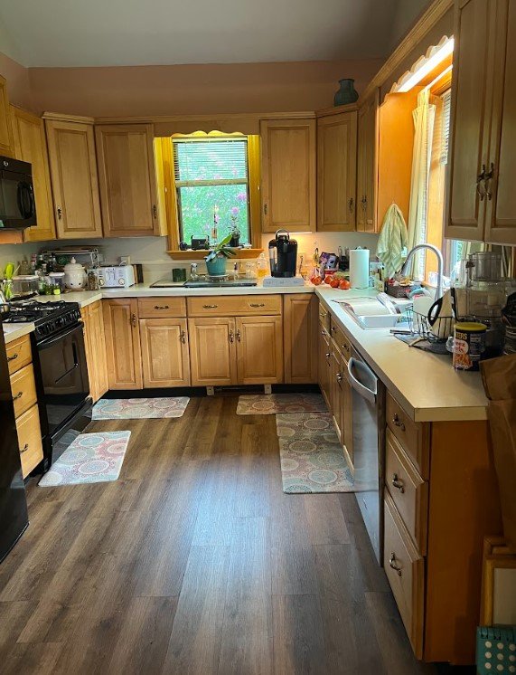
Episode 5 is already here! This season is flying by. This special project started as a midcentury, modern space that was closed off and dark and evolved into an open and bright home. When we first walked into Sue and Rich's home, it was disjointed, dark and there were LOTS of rugs. 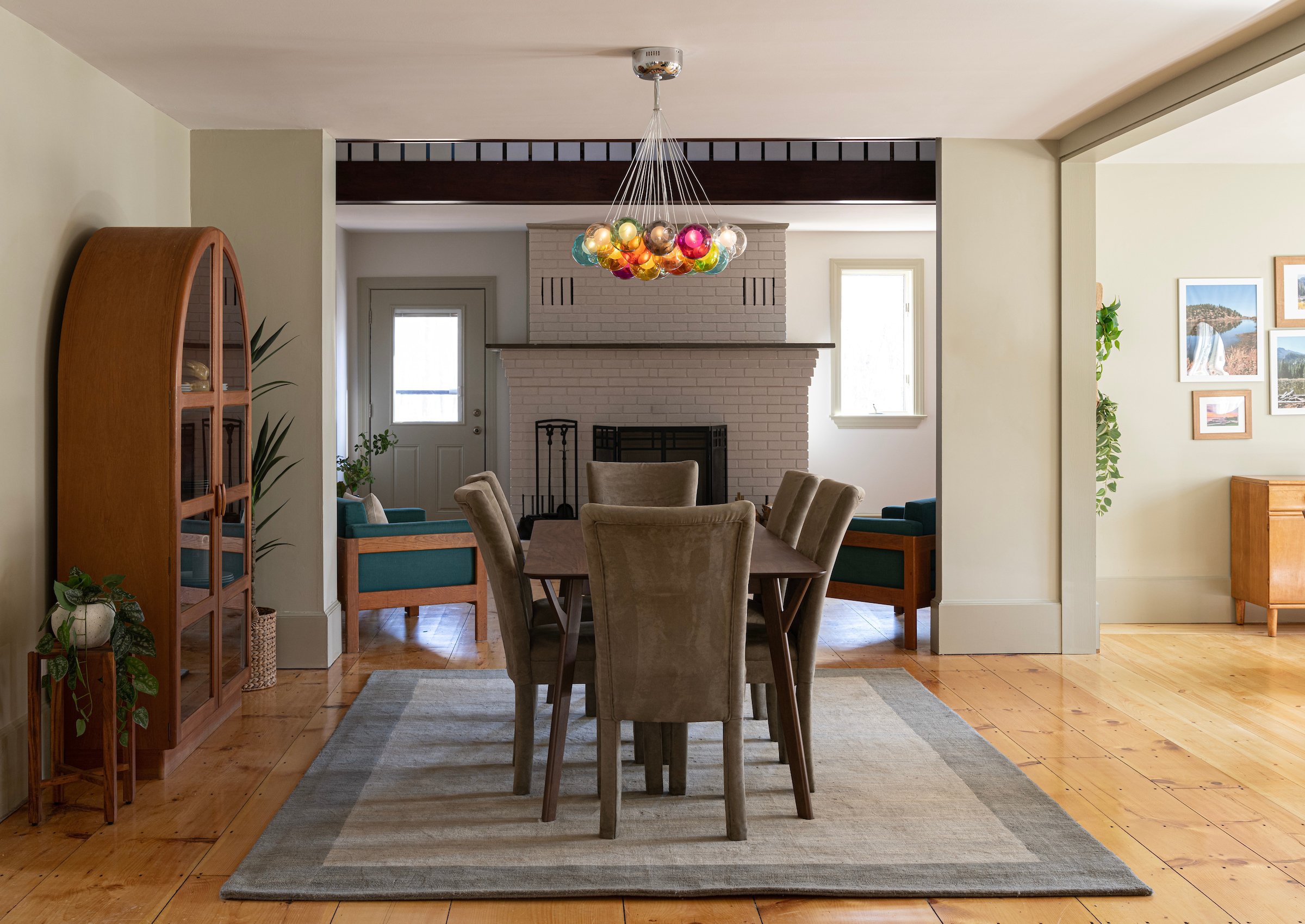
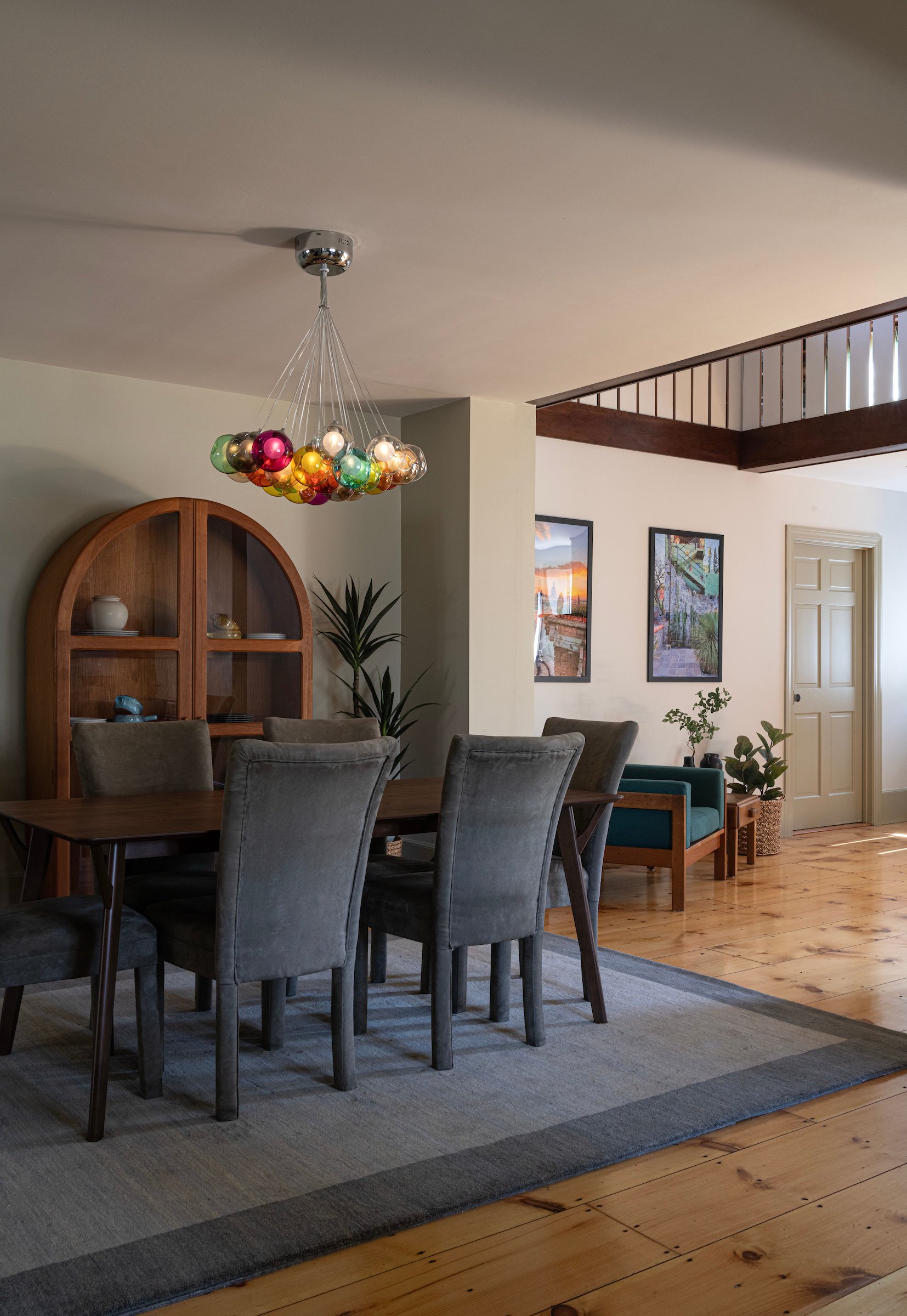
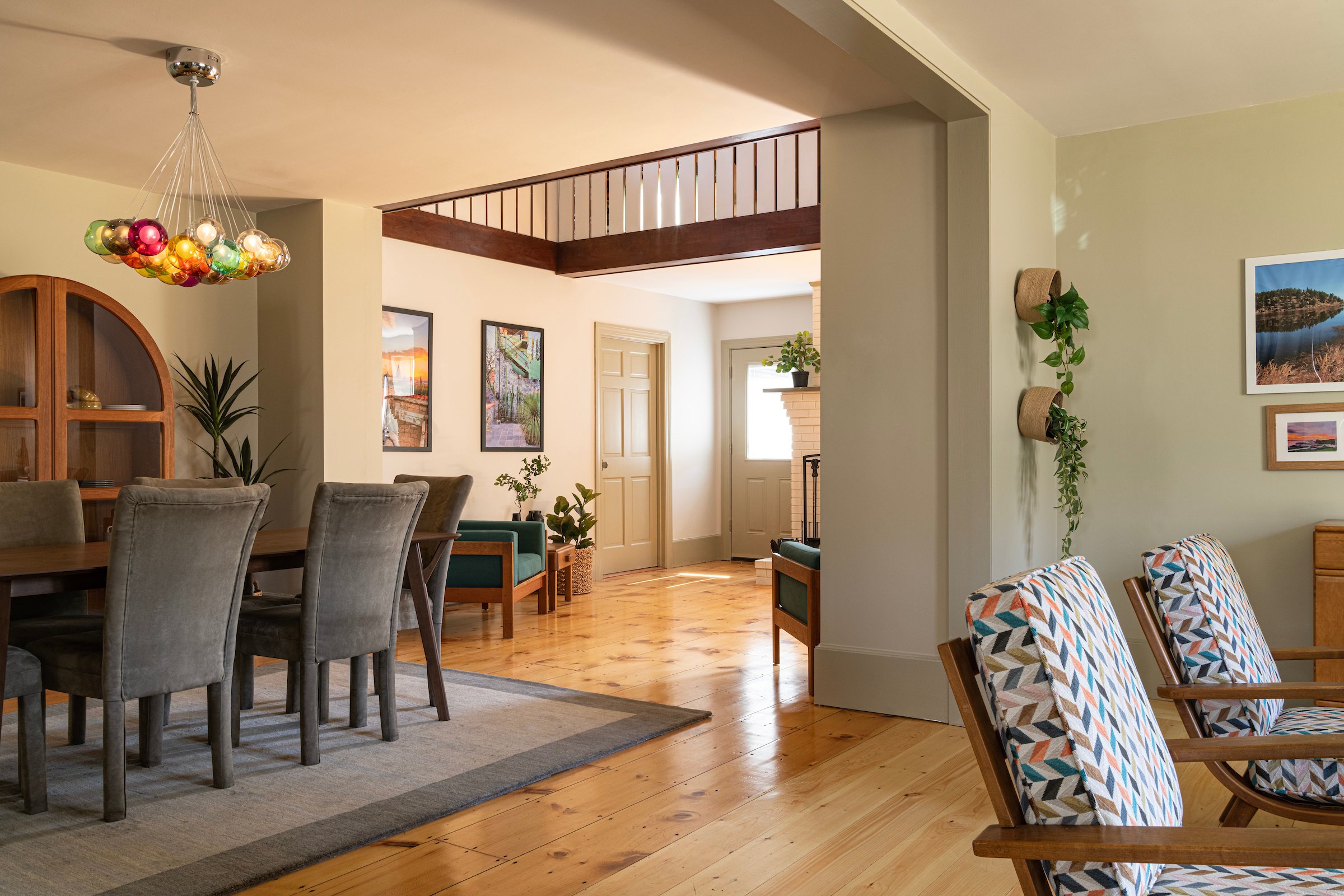
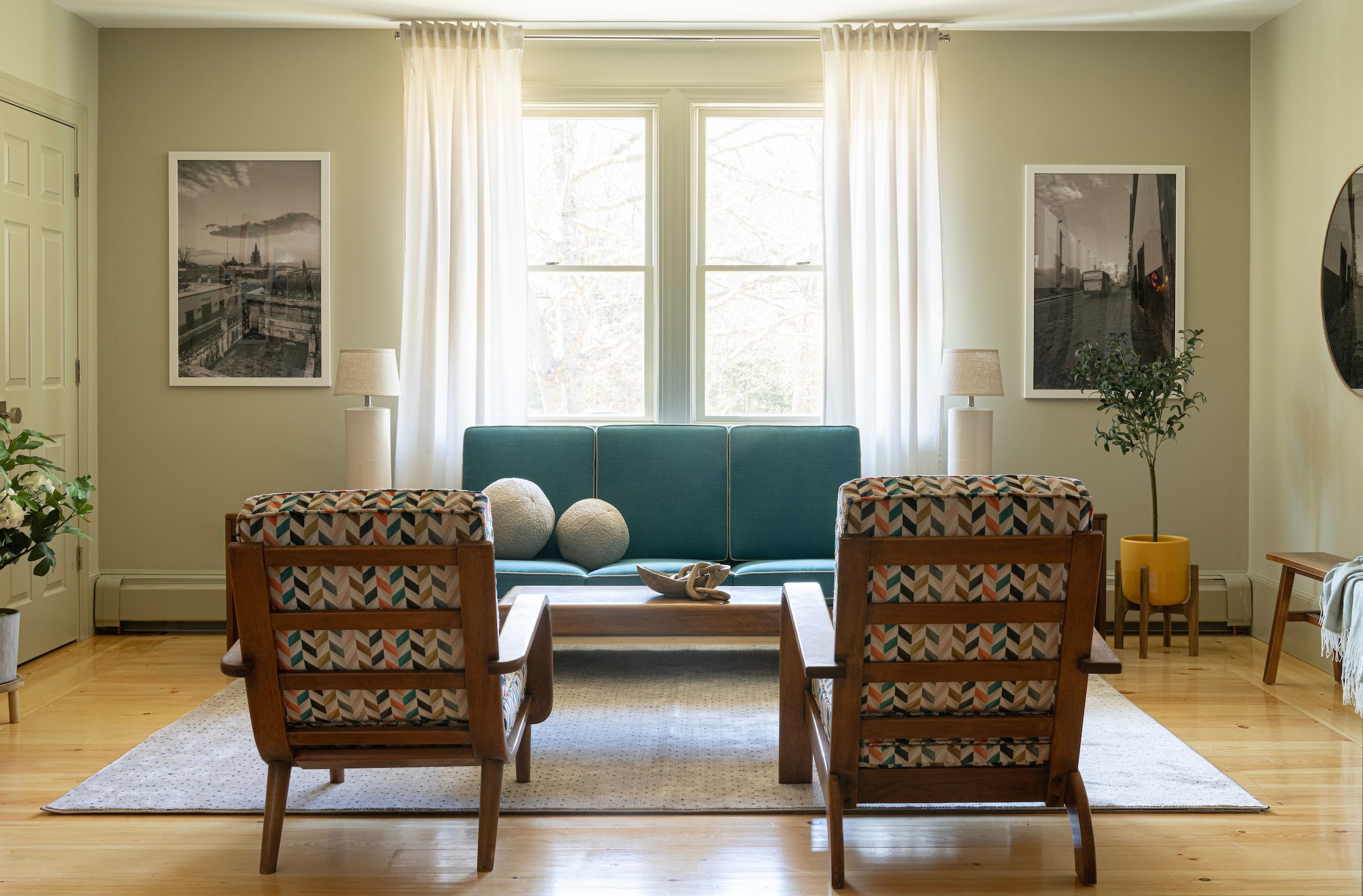
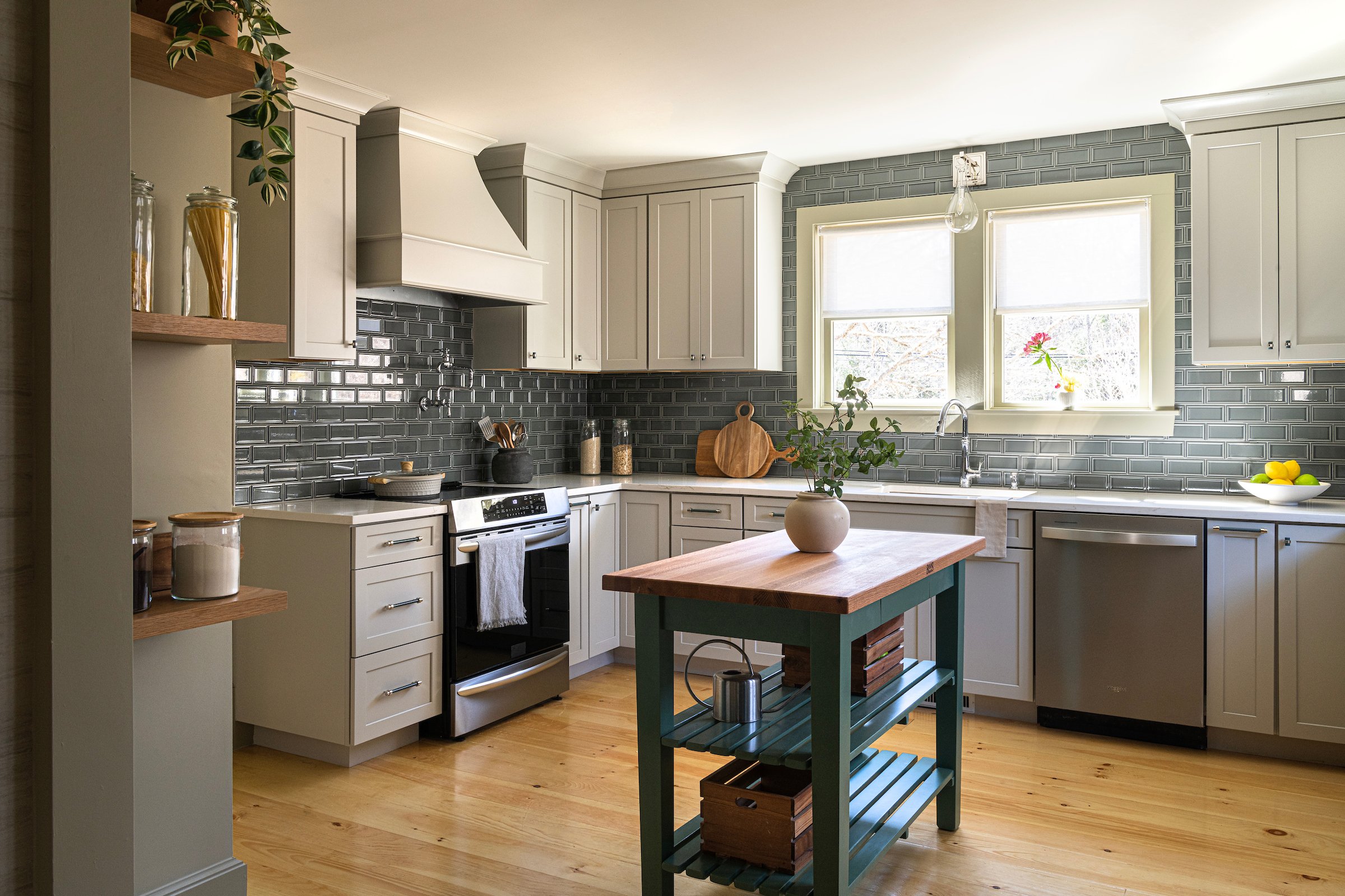
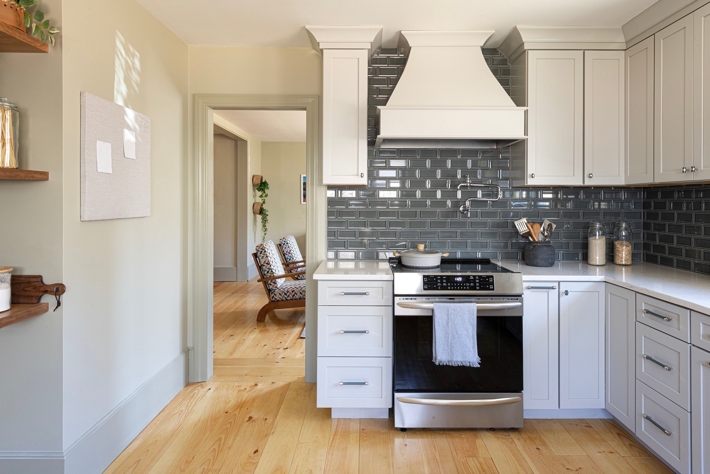
Color was an incredibly important element to Sue. While she knew she wanted greens and blues, it took a little digging to narrow down the shades that she felt good about. Denese chose seven paint samples and had to go through a process of elimination to land on the perfect color. Greys and whites were definitely out! We decided on Spanish Olive for the walls which created a calming environment for Rich and Sue. One of our favorite elements of this design was finding ways to incorporate color. In Sue's previous home, each room had a different color paint on the walls which really divided the space. She even called it the "Easter House" because of all of the different colors throughout the home. Denese wanted to honor her desire for color while still creating a cohesive space. Paint isn't the only way to incorporate color in a home! Other elements that we used were the lighting fixture in the dining room, the reupholstered furniture and the beautiful ceramic tile in the kitchen and wet bar space. Now, a little peak behind the scenes! Before reveal day, the camera crew films the home and in order to capture the massive changes that have taken place, they will often change out the bulbs to brighten the space even more. While this really helps to see the dramatic changes that are made, sometimes it can make it difficult to appreciate the color tones on the walls and things on camera may not appear as exactly what they are in their natural state. We are so grateful to work with Megan Booth to capture details of the design, textures and images. Looking at the photos really allows us to appreciate the paint colors, textures, hues for each space. 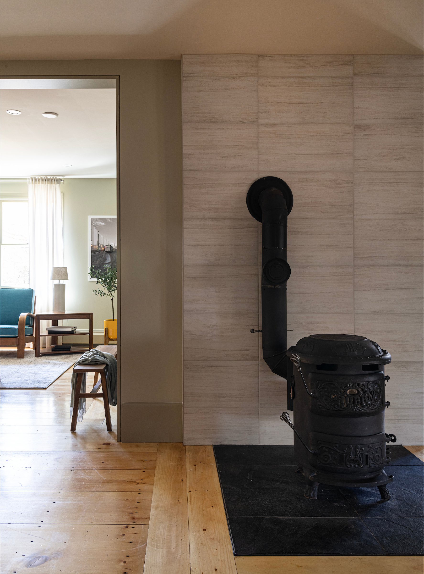
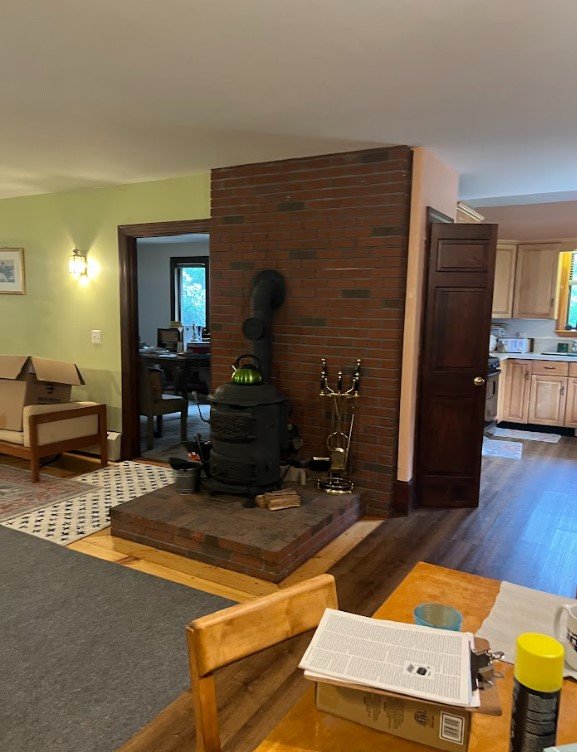
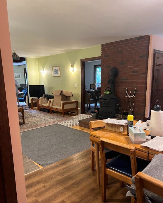
While Rich and Sue wanted to ensure they had a beautiful design aesthetic in their home, they also knew it had to be functional. For them, the coal stove was a contentious piece as it had a functional element by providing warmth but the set up of the stove was an actual tripping hazard! Sue was ready to move on from the stove but Rich liked the practicality of having it in their home to use during cold New England months. We were able to remove the brick platform that the stove originally sat on top of and add beautiful, textured tile that was heat resistant and complimented the rest of the house.After the show aired, Denese received a message from Sue and Rich sharing that their home is now "chic and serene." We are so thankful to be a part of taking this Frankenhouse and transforming it in to an open, bright and welcoming home! Join us next Sunday at 9pm ET for the final Episode of Season 1 of Fix My Frankenhouse! 
